The trading world can be a maze of uncertainty, where every decision carries a level of risk.
In such a landscape, having powerful allies is crucial…
…and this is where the Ichimoku Cloud boldly rolls in!
In this article, you’ll embark on a journey – learning to harness the raw capabilities of Ichimoku Cloud.
Although it may seem complex at first, it offers a truly multifaceted approach to trading.
It can provide crucial insights, predictions, and signals to enhance your decision-making significantly.
From identifying trends to pinpointing support and resistance levels, Ichimoku Cloud is a versatile tool with excellent potential for your trading strategies.
So in this article, you’ll discover:
- What exactly the Ichimoku Cloud is.
- Where to find this powerful tool.
- The five vital components that make up the Ichimoku Cloud.
- Real-world examples illustrating how to use it effectively.
- Honest insights into its limitations.
- The compelling benefits it brings to your trading journey.
Ready to change your trading forever?
Great, let’s do it!
Where to find the Ichimoku Cloud
Let’s start with where you can find the Ichimoku Cloud.
You can find the Ichimoku Cloud by navigating to the Indicators button at the top of your Tradingview panel as shown below…
Next, search for Ichimoku Cloud using the search bar, and select it under the Technicals heading…
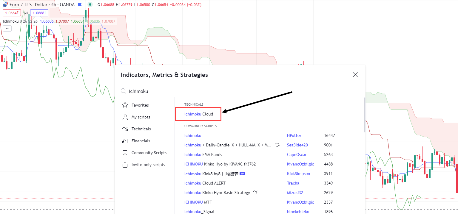
Once you’ve located “Ichimoku Cloud”, select it – and you’re ready to begin your analysis!
Let’s dive in!
What is Ichimoku Cloud?
The Ichimoku Cloud is one of the most commonly used technical analysis tools among traders.
Unlike most indicators that provide historical and present data, the Ichimoku Cloud stands out by projecting future levels through the cloud.
Its popularity stems from an ability to identify possible support and resistance levels, as well as visually representing trend direction and momentum through concepts such as its ‘cloud’.
Ichimoku Cloud is a powerful tool with a clear purpose: to provide comprehensive chart information at a single glance.
It offers depth without unnecessary complexity, making it accessible to traders of all levels.
Now I know what you might be thinking:
“Ichimoku Cloud sounds complex!”
And at first glance, it may seem difficult to understand.
However, as you delve into the components that make up Ichimoku Cloud, you’ll begin to grasp its concepts and potential as an indicator.
With practice, you will be able to glance at an Ichimoku Cloud chart and have a much clearer indication of what might occur!
So, let’s break down the components of an Ichimoku Cloud chart .
The Five Key Components of the Ichimoku Cloud
The Ichimoku Cloud is composed of five crucial components, each offering valuable insights that are connected to predict future price actions and trends.
Now, let’s delve into these components by discussing them individually and examining how they appear on a chart.
Conversion Line
First, you have the Tenkan-Sen also known as the Conversion Line…
Ichimoku Cloud Conversion Line Chart:
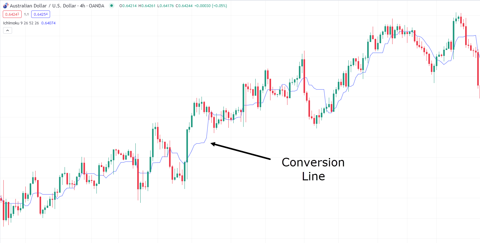
The Conversion line, a component of the Ichimoku Cloud, serves as a short-term moving average.
It’s calculated by averaging the highest high and lowest low over a specified period, typically set at 9 periods.
The primary function of this line is to illustrate the short-term price momentum.
It’s worth noting that the Conversion line differs from regular moving averages, which often rely on the closing prices of individual candles rather than the high and low points.
Next up, you have the…
Base Line
The Kijun-Sen, also known as the Base line…
Ichimoku Cloud Base Line Chart:
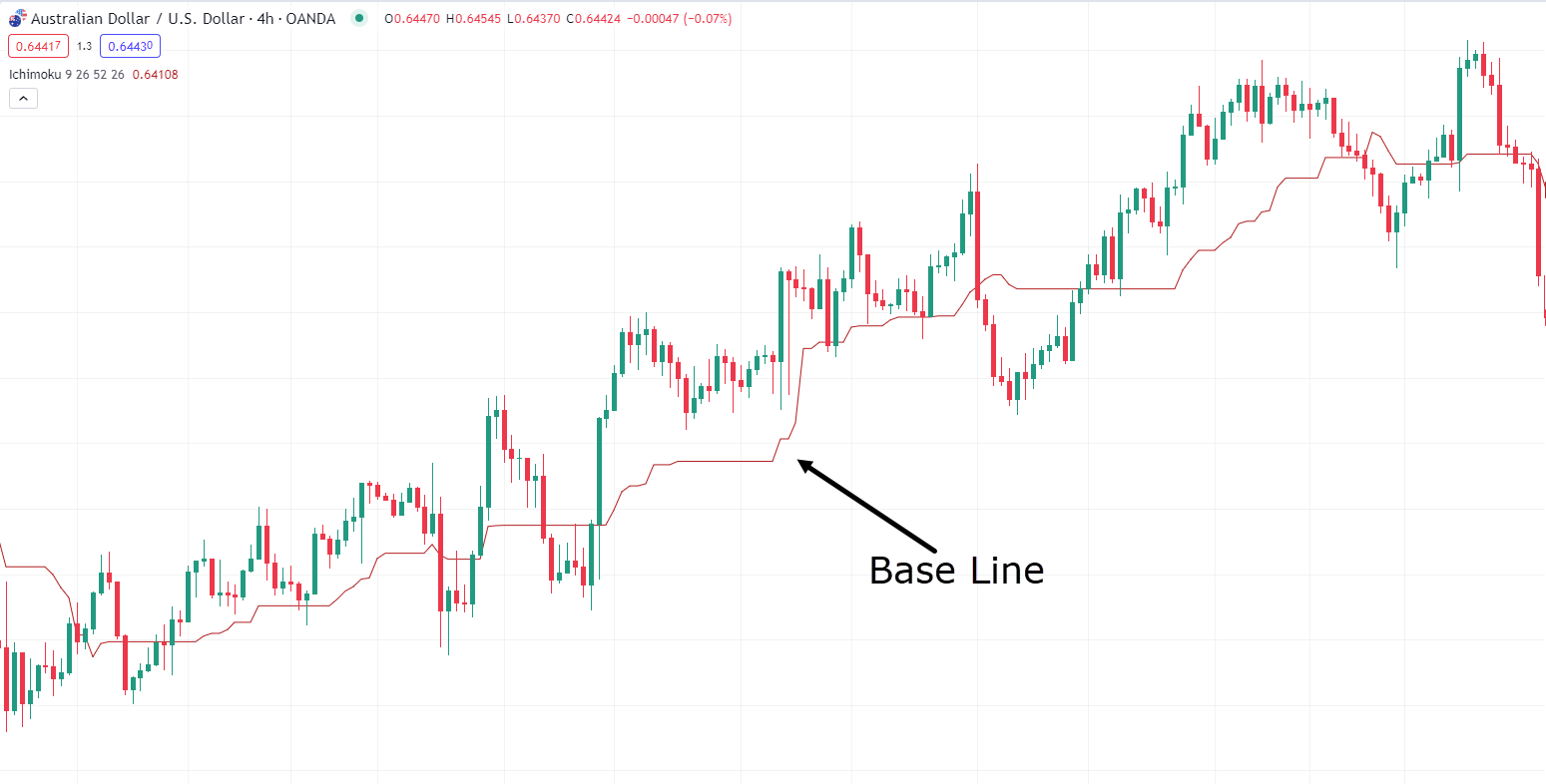
The Base Line in the Ichimoku Cloud system serves as the longer-term moving average.
It’s calculated like the Conversion Line but employs a longer period.
By default, this period is set at 26.
Think of the Baseline as a representation of medium-term price momentum.
Now, take a look at the…
Lagging Span
This is the Chikou Span, also known as the Lagging Span…
Ichimoku Cloud Lagging Span Chart:
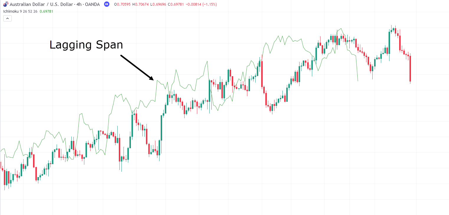
The Lagging Span within the Ichimoku Cloud system has a unique role.
This line represents the closing price of the current period but is plotted 26 periods back on the chart. As the name suggests, it lags behind the current price.
Its purpose is to show the current closing price’s position relative to past price action.
The Lagging Span actually serves various functions, including confirming momentum and identifying support and resistance levels, among others.
Onto the next component…
Leading Span A
Next, you have the Senkou Span A, also known as the Leading Span A…
Ichimoku Cloud Leading Span A chart:
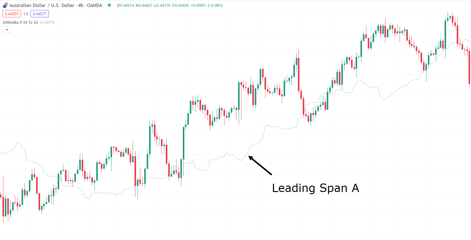
The Leading Span A line offers a unique perspective.
It represents the midpoint between the Base Line and Conversion Line, projected 26 periods ahead.
This projection aids in identifying potential future support and resistance levels. It is often used in conjunction with the Senkou Span B, also known as the Leading Span B.
Speaking of which…
Leading Span B
Ichimoku Cloud Leading Span B Chart:
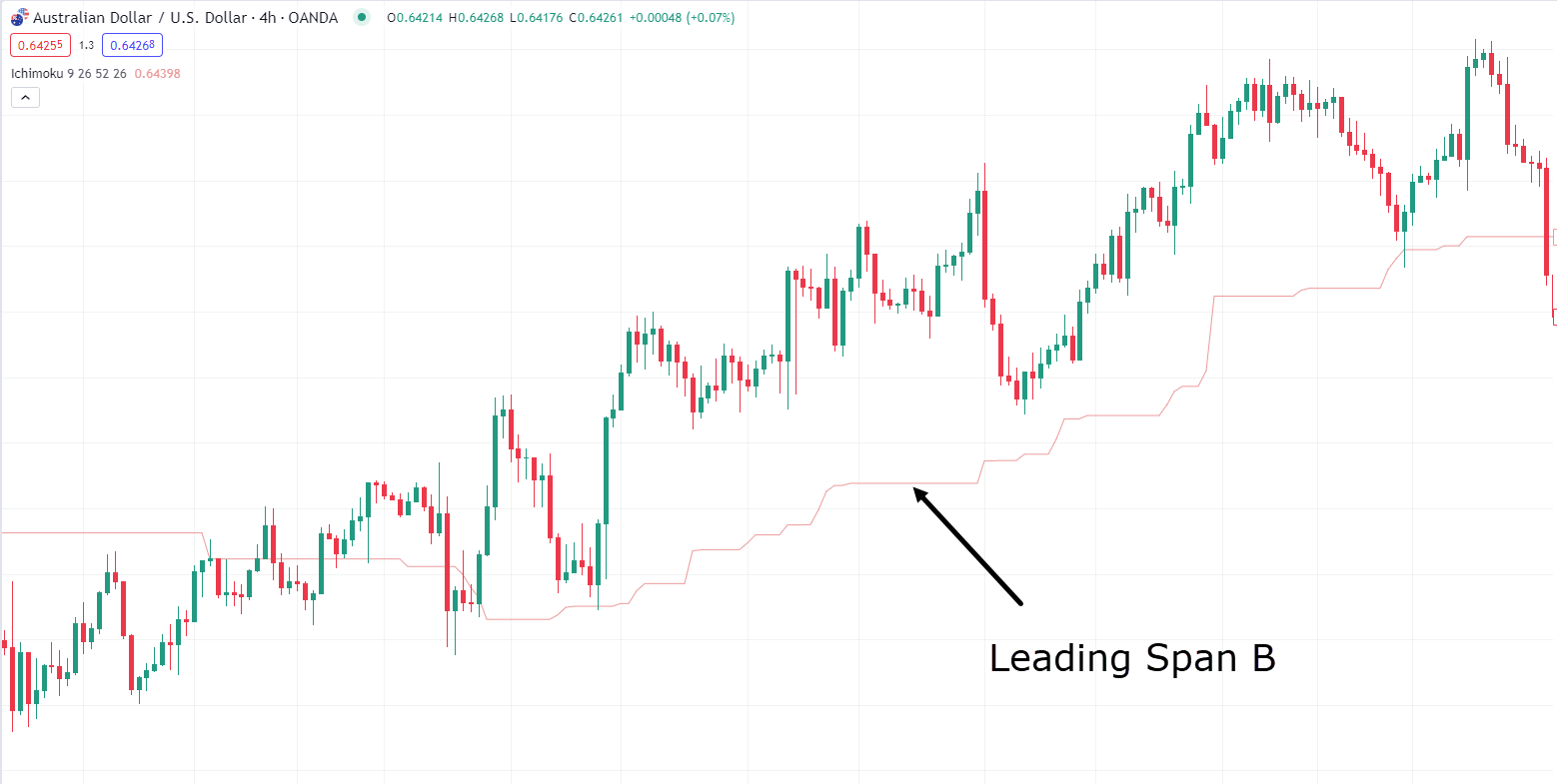
Senkou Span B or the Leading Span B is calculated similarly to the Span A line but over an extended period, typically 52 periods back.
Like Span A, it projects 26 periods ahead and is a valuable tool for identifying future support and resistance levels.
When combined, these two Span lines create what’s known as the Kumo Cloud…
Kumo Cloud
Ichimoku Cloud Kumo Chart:
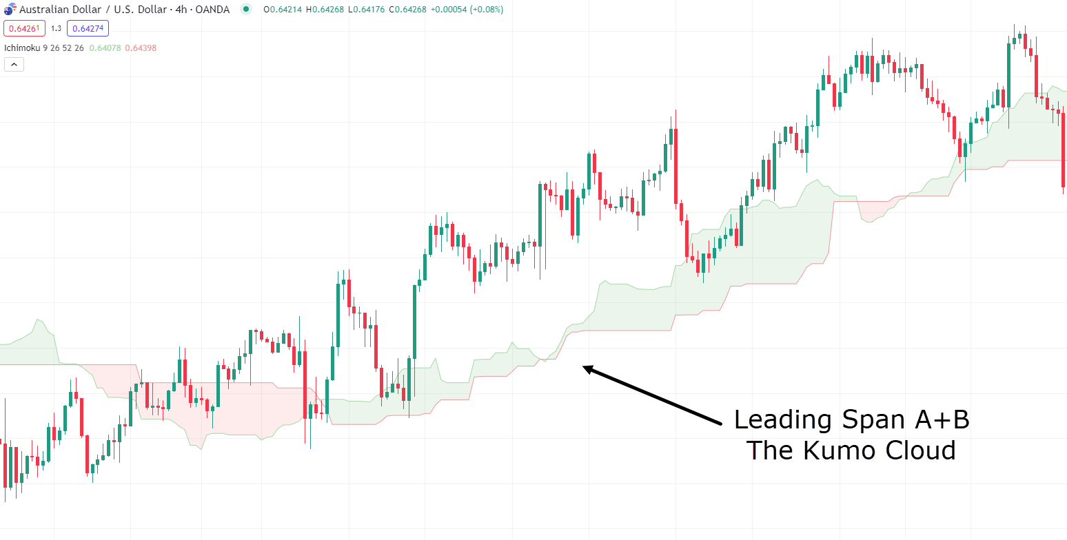
The Kumo Cloud plays a vital role in the Ichimoku Cloud system.
It provides critical future levels and offers insights into market volatility and trend strength.
Let’s plot all these data points onto the chart and see what it looks like!…
Ichimoku Cloud AUD/USD Chart:
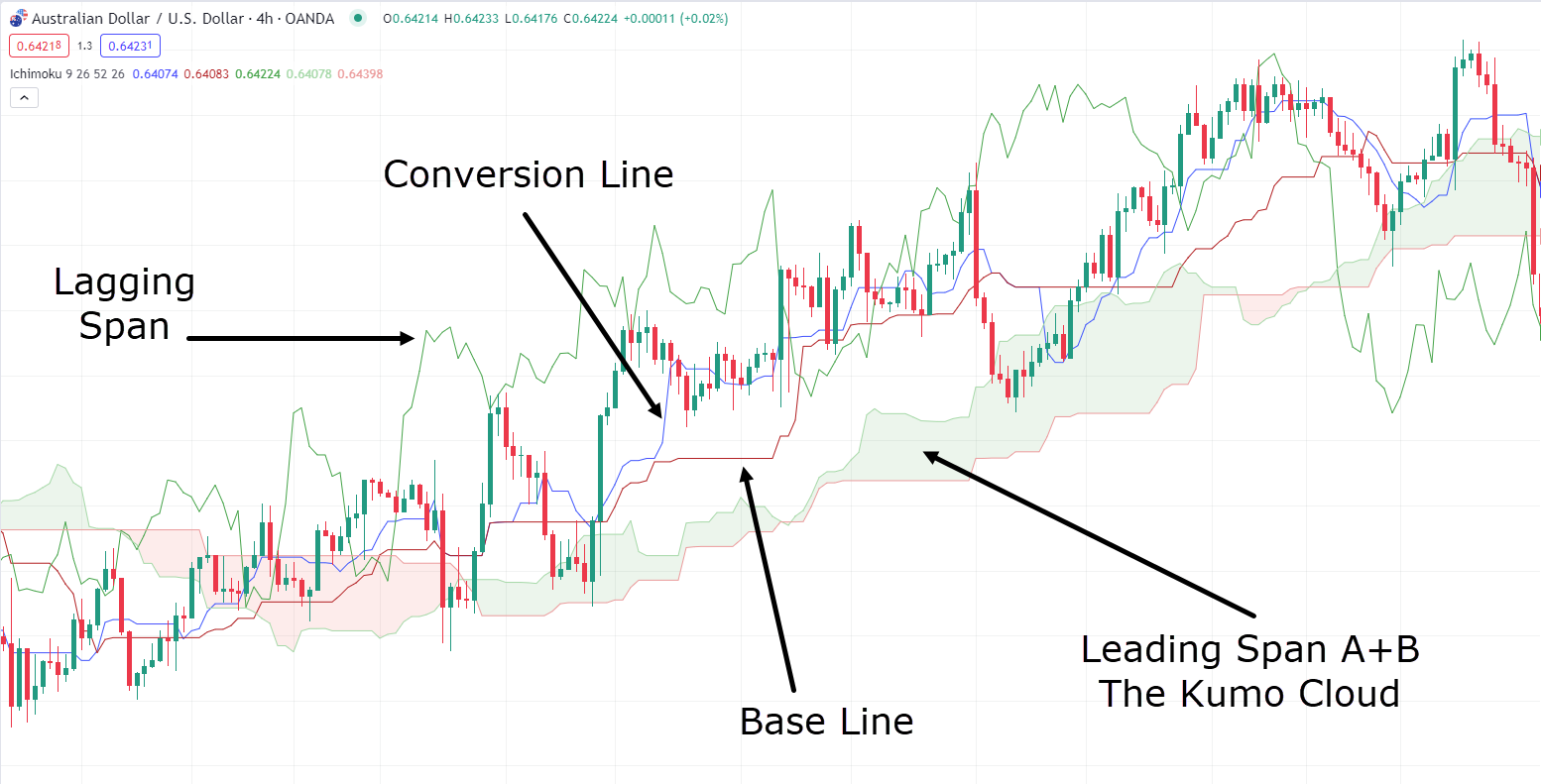
I know, right!?
What’s going on!?
Well, at first, it can seem overwhelming with so many components to consider…
However, in the following sections, I’ll guide you on effectively using each element of the Ichimoku Cloud at the most opportune moments!
How can you use Ichimoku Cloud?
Although Ichimoku Cloud looks overwhelming, this article will give you a much clearer understanding of how to use it effectively.
In this section, I will provide you with some practical examples to better recognize what to look for and when.
Let’s begin with some fundamental principles of how to use the Ichimoku Cloud.
Firstly, Ichimoku Cloud enables the identification of trends, a task simplified through the Kumo Cloud.
If the price is above the cloud, it is considered bullish, whereas if it falls below the cloud, it is regarded as bearish…
GBP/JPY 4-Hour Bullish Ichimoku Cloud Chart:
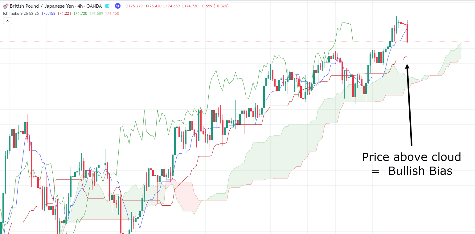
In this chart, you can see that the price is respecting the cloud and staying well above it, indicating a strong bullish trend!
GBP/JPY 4-Hour Cloud Support Chart:
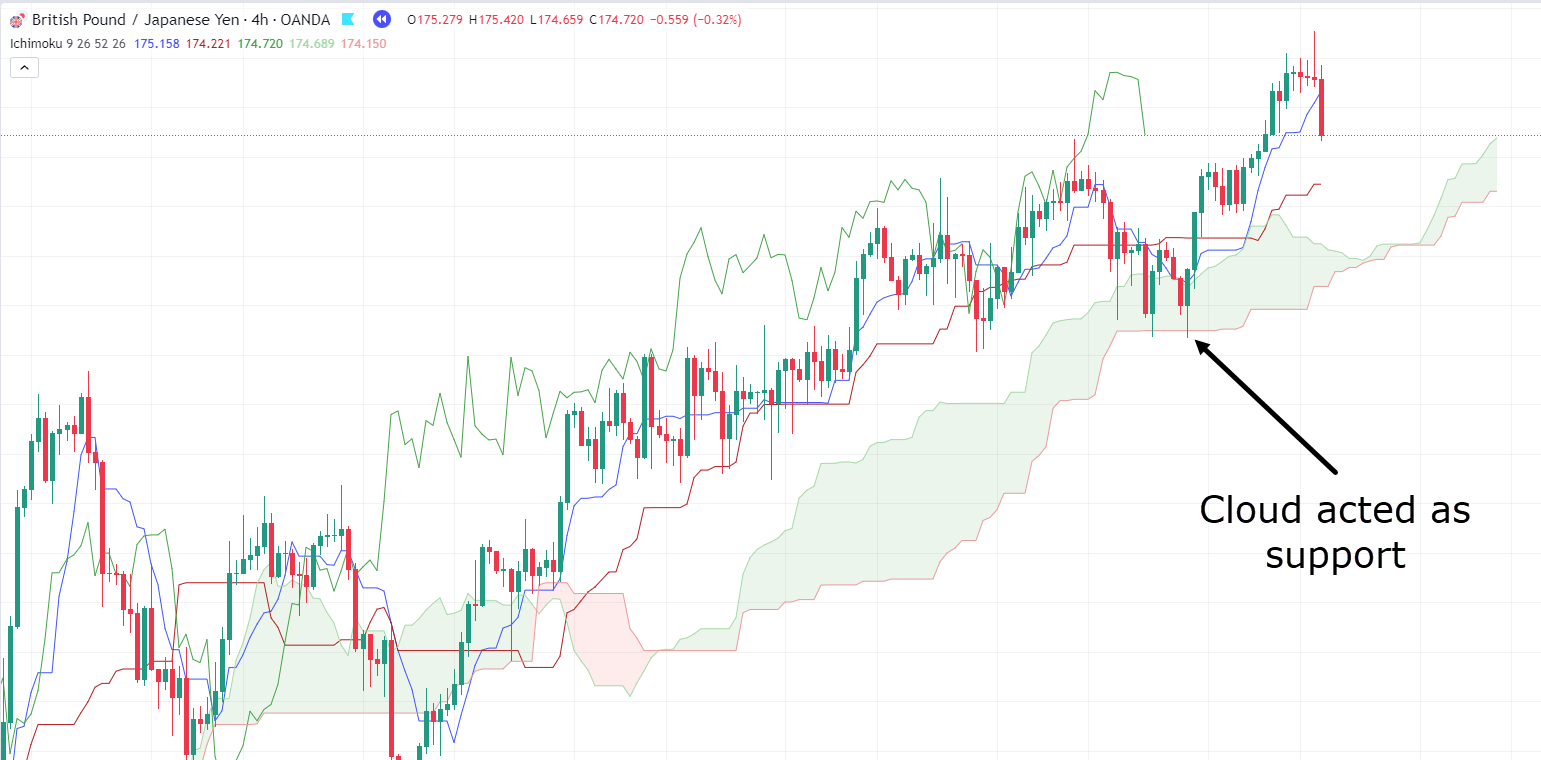
Another interesting observation from the chart is how the cloud itself can act as a dynamic support and resistance zone.
What sets Ichimoku Cloud apart is its creation of this dynamic zone instead of a static level.
This zone expands and contracts with shifts in momentum and volatility, offering traders a flexible support and resistance area instead of a rigid single line!
Now, let’s move on to crossovers…
When the Conversion Line crosses above the Baseline, it often signals a shift towards a bullish trend.
Conversely, if the Baseline crosses above the Conversion Line, it suggests a shift towards a bearish trend.
Let’s look at a bearish example!…
GBP/USD 4-Hour Chart Crossover:
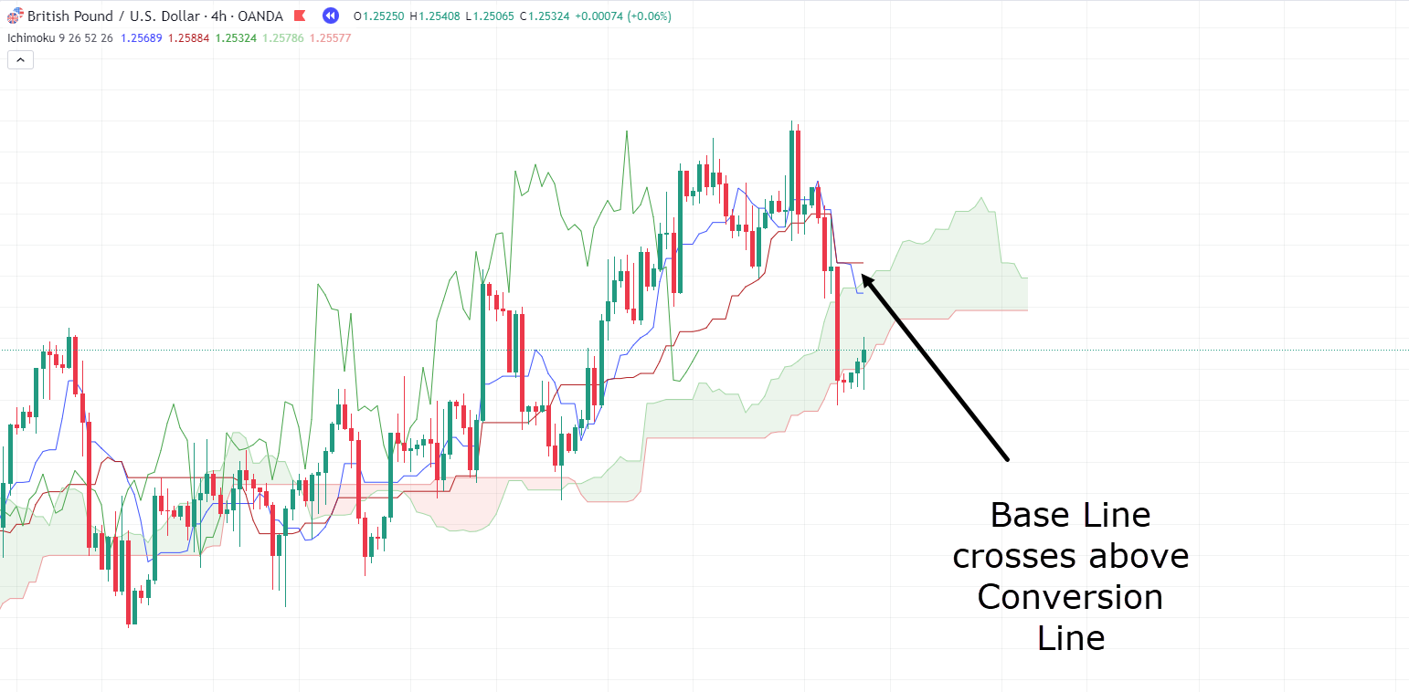
This crossover represents a shift in momentum from bullish to bearish.
It probably comes as no surprise to see this crossover following such a strong bearish candle, right?
In fact, you might have already spotted something intriguing in the chart above…
The cloud remains green, and the price is using it as support!
This leads us to another valuable aspect of the Ichimoku Cloud charts: the Kumo Twist.
When the cloud transitions from green to red or vice versa, it can be likened to a ‘twist’.
Imagine it as shifting from green to red or vice versa – essentially flipping the bias.
So your discovery is a very valid one!
Acting under the cloud and waiting for a twist is much better confirmation than just a crossover.
Let’s see what unfolds!…
GBP/USD 4-Hour Chart Cloud Twist:
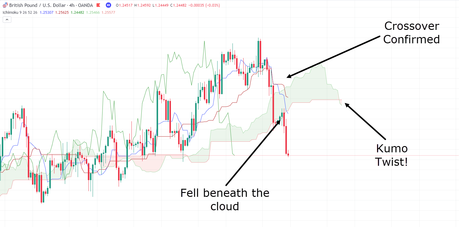
Notice how, as you start piecing together all the different components of Ichimoku Cloud, a detailed story of the market unfolds…
It’s undeniably valuable, isn’t it?
So, while Ichimoku Cloud charts may appear daunting at first glance, the complexity fades once you understand how to interpret them,
In essence, when you break down Ichimoku Cloud, you’re simply searching for multiple confirmations of trend shifts, before strategically planning your entry on the correct side of the market.
That sounds great in theory, but to truly appreciate the superpower of Ichimoku Cloud, let’s examine some real trade examples and delve deeper into their analysis!
Take a look at this chart…
USD/CAD 4-Hour Ichimoku Cloud Chart:
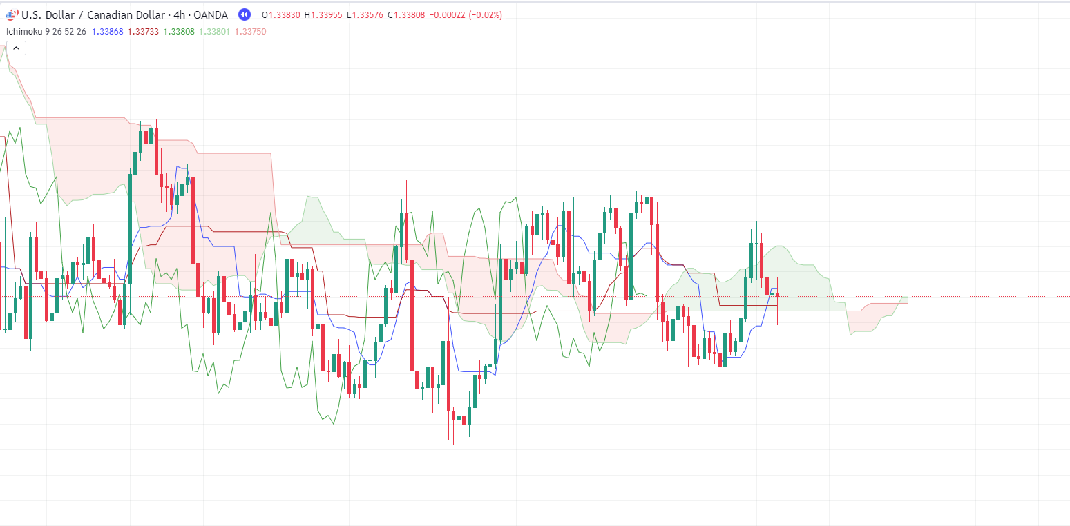
I know – at first glance, it seems pretty chaotic!
Some might even argue that Ichimoku Cloud is generating false signals all over…
But let’s set aside doubt and dive deeper into the analysis.
Clearly, the price is oscillating above and below the zone.
However, what should you be looking for when considering a long position?
First and foremost, you want the price to be above the cloud, preferably with the cloud itself being green or undergoing a twist.
Next, you ideally want to see the Conversion Line and the Base Line crossing over.
Lastly, you’d look for the cloud to act as some form of support.
As you observe from left to right, none of these favorable conditions seem to have occurred…
…until the current moment, that is!…
USD/CAD 4-Hour Ichimoku Cloud Chart:
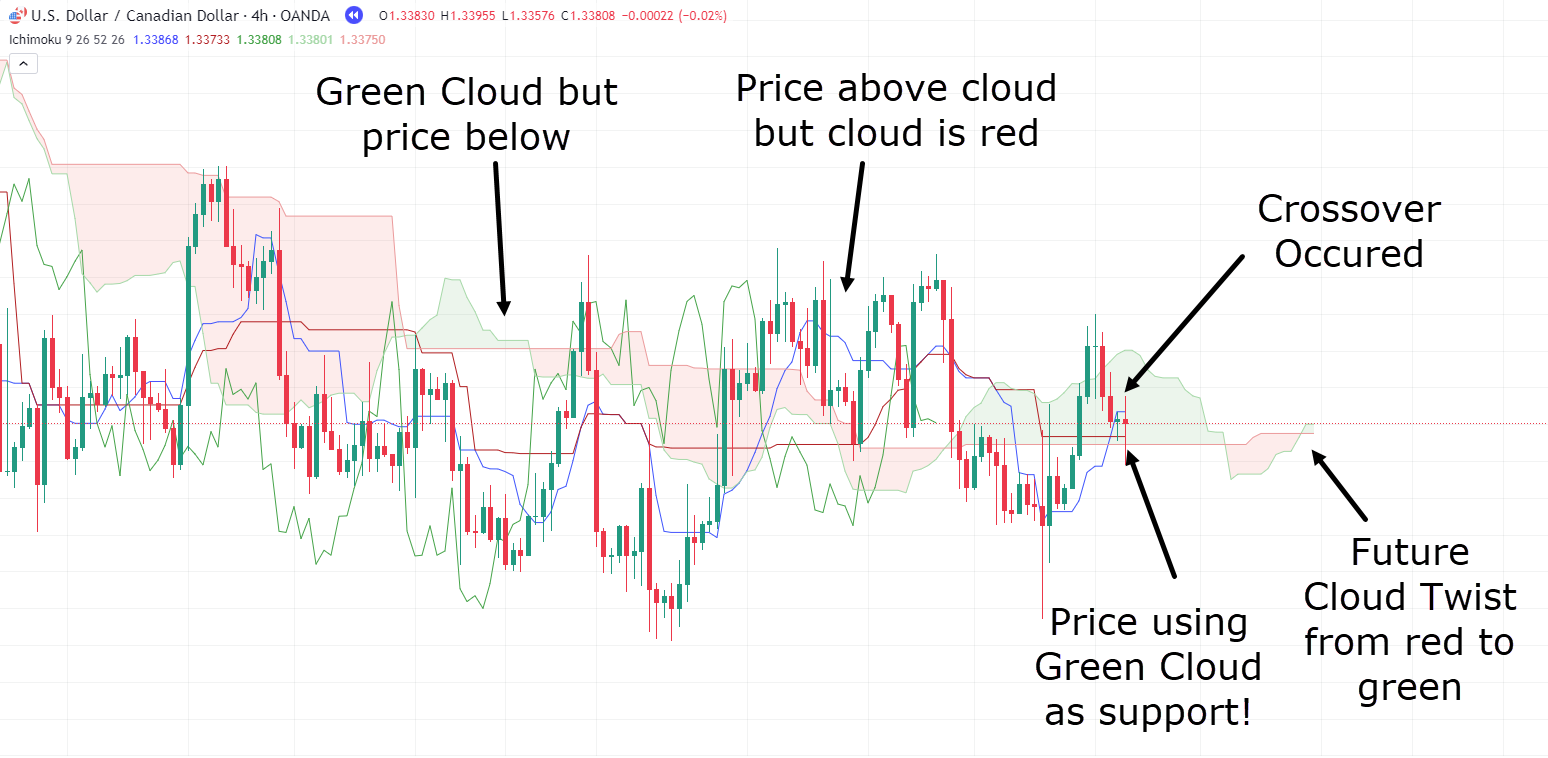
Everything is on your side for a trade. Let’s take one…
USD/CAD 4-Hour Chart Long Trade:
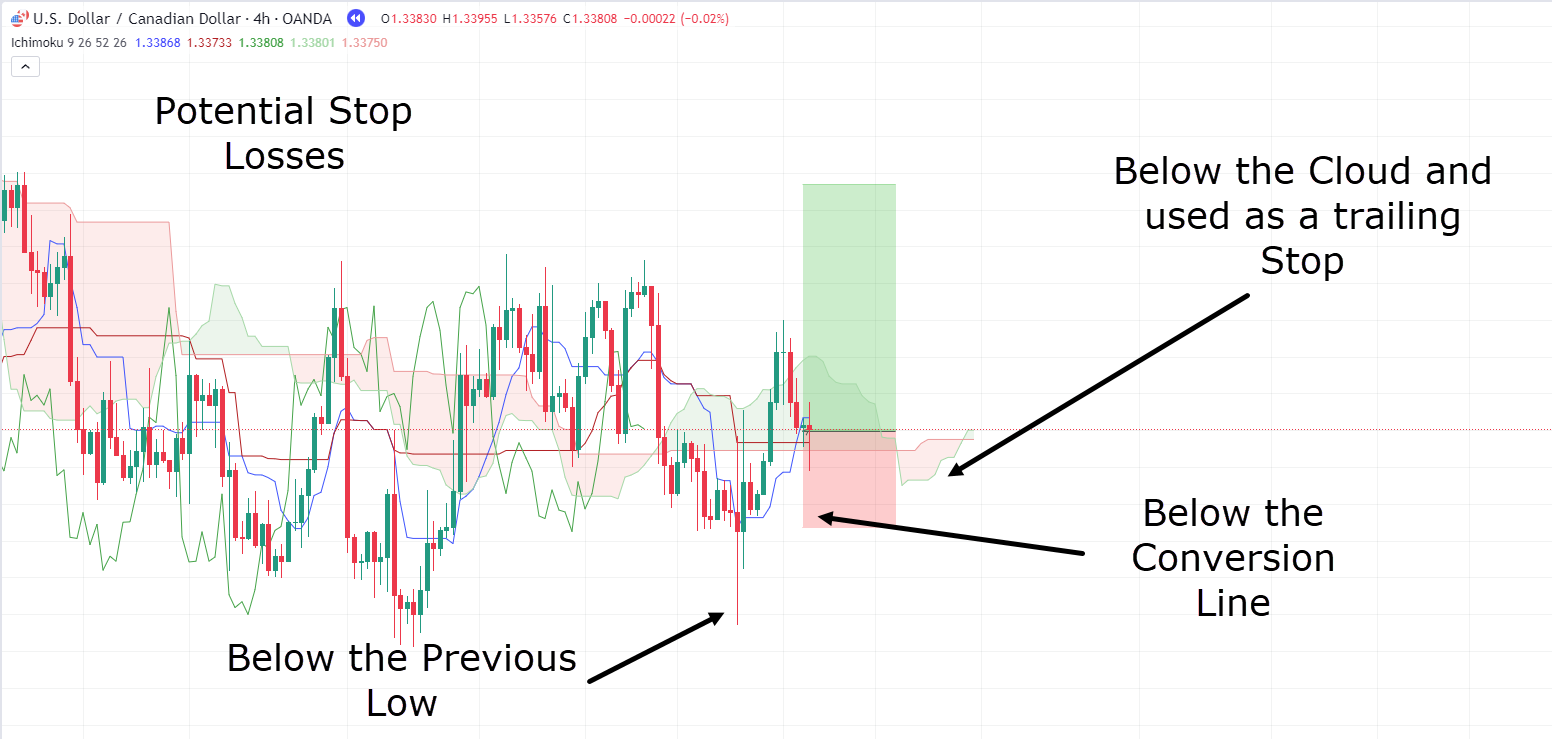
As always, when planning a trade, it’s essential to know where you will exit if the trade goes against you.
Luckily, Ichimoku Cloud can also be a valuable tool for stop-loss placement.
The first option is to place the stop below the previous low. While this may result in a wider stop, it minimizes the risk of being stopped out due to a large wick.
The second option is to position the stop below the Conversion Line. This level serves as a midpoint where, based on shorter-term trends, you expect price respect.
Lastly, you could consider placing your stop below the lowest part of the cloud.
This is because logically, the cloud is intended to act as support.
So, if the price falls and closes below the cloud, it invalidates your trade theory, and you would no longer want to remain in the trade!
It’s important to note that none of the above options are inherently right or wrong – it’s a matter of testing what works best for you.
Now, when it comes to taking profits, there’s no universally correct answer.
Some traders use a break of the cloud as an exit trigger, while others wait for a bearish crossover between the Conversion and Base Lines.
Some may even wait for all the triggers to align before taking profits.
It’s basically a rule that you can develop over time, after practising and using Ichimoku Cloud – optimizing it for your trading system.
Let’s see how each of these take-profit approaches would have performed…
USD/CAD 4-Hour Chart Take Profit Crossover:
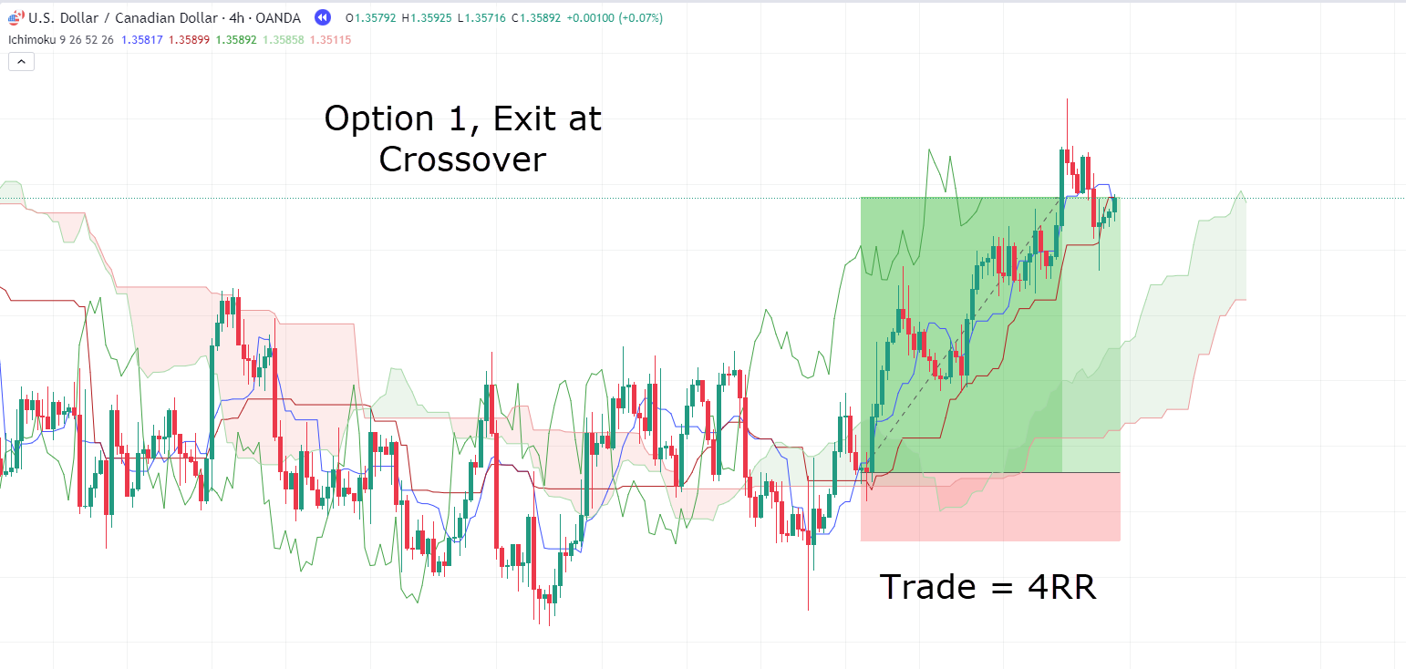
Great!
In this trade, you’ve achieved a 4RR (Risk-Reward Ratio) and opted to exit the trade at the initial sign of weakness.
Now, let’s determine if, in this particular example, it was an early exit…
USD/CAD 4-Hour Chart Take Profit Close Below Cloud:
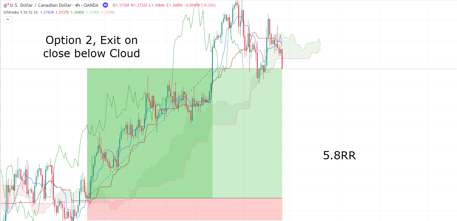
OK, so it looks like option 1 for the exit might have been a bit premature!
This trade resulted in a 5.8RR, although it required more patience for it to fully develop.
Note that the occurrence of the close below the cloud aligning with the crossover suggests that this trend might have indeed concluded.
Now, the last potential confirmation to wait for would be when the cloud twists to red…
USD/CAD 4-Hour Chart Take Profit 3 Triggers:
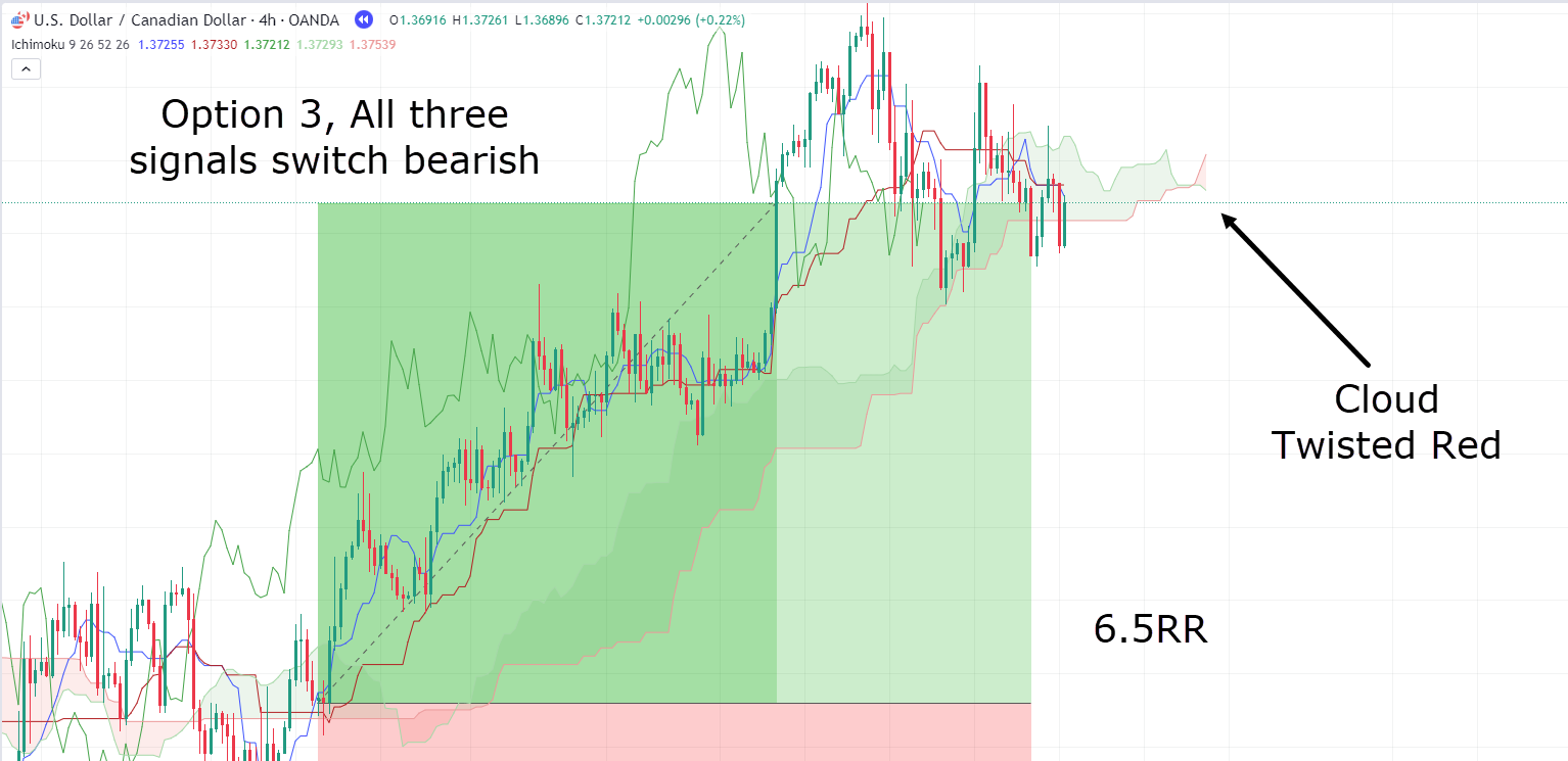
And there it is.
The most favorable outcome occurred when waiting for all three triggers to turn bearish!
However, it’s essential to recognize that this outcome won’t always be the case!
In certain instances, especially when the market experiences a rapid decline with significant momentum, waiting for the indicator to shift might eat into substantial profits…
As mentioned earlier, it’s crucial to consider everything in the context of market conditions and determine what aligns best with your trading strategies.
Now, let’s delve into another example, this time on the short side…
GBP/USD 1-Hour Chart Short Trade:
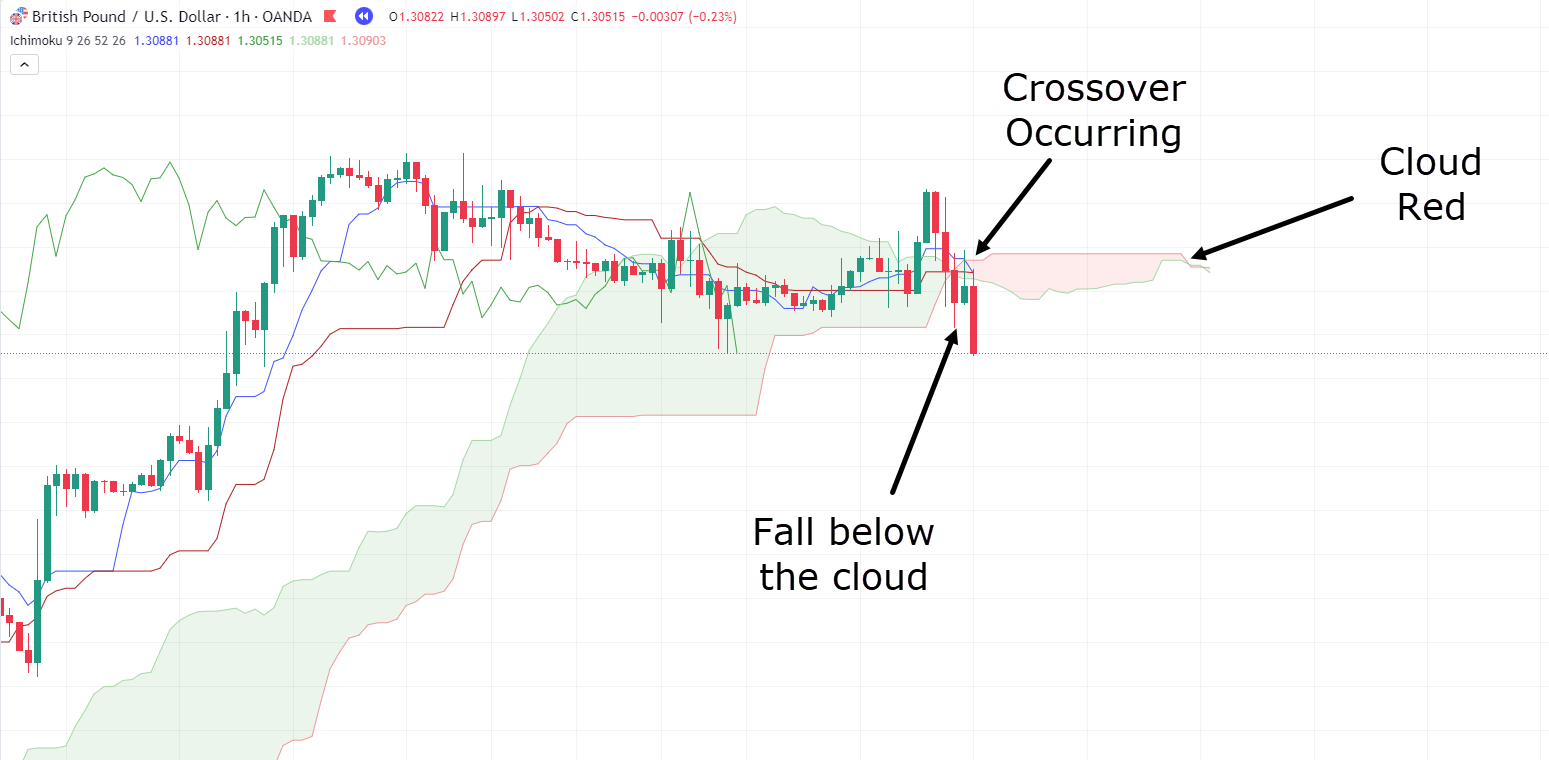
As demonstrated in the example, you can observe several bearish signals:
– the price has fallen below the cloud
– a twist has occurred, transitioning the cloud from green to red and finally
– the Conversion and Base Lines have crossed over in a bearish manner.
Now, before initiating a sell, let’s consider your options for placing the stop loss and plan your exit strategy…
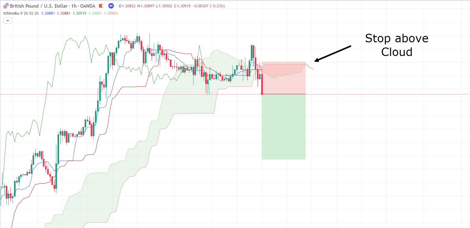
GBP/USD 1-Hour Chart Stop Placement:
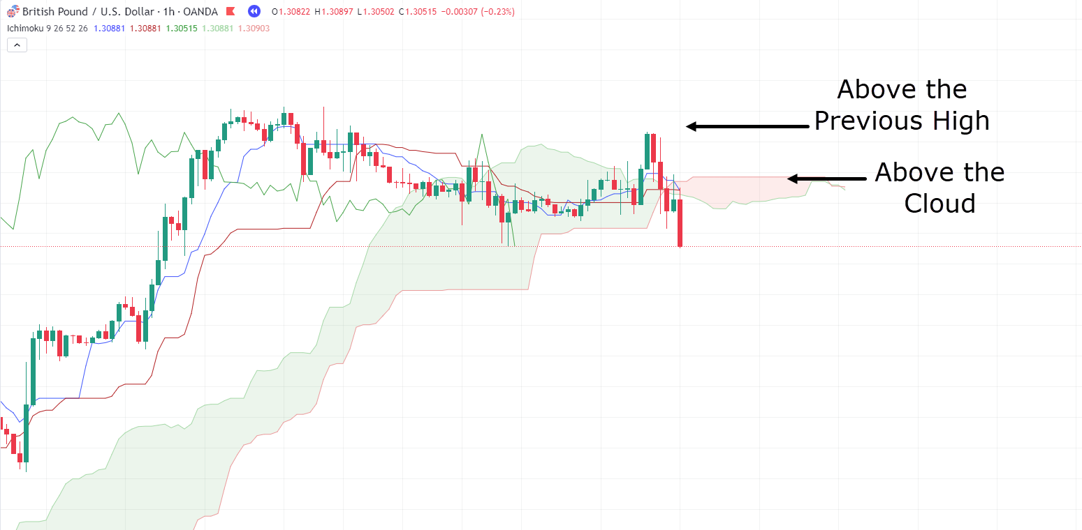
So, two evident stop-loss placement options stand out.
For the sake of this trade, let’s select the cloud as your stop-loss placement.
And what about the take-profit target?
Imagine keeping it straightforward: the moment you witness a break and a close above the cloud, you decide to exit the trade.
This approach can be likened to using a trailing stop.
Let’s visualize how this trade would appear…
GBP/USD 1-Hour Chart Entry:
Alright, great!
Our trade plan and setup are in place.
So let’s observe how this trade unfolds and whether it is successful or not…
GBP/USD 1-Hour Chart Result:
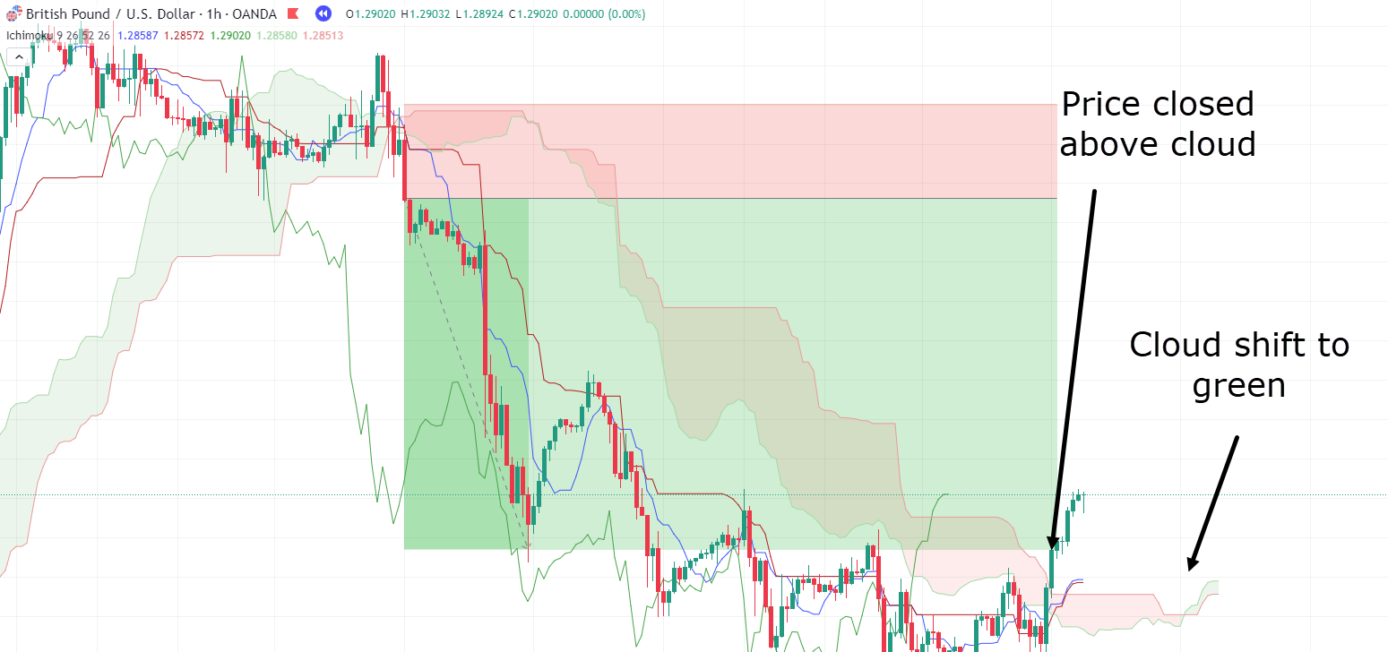
Impressive! Another successful trade!
Once more, waiting for the close above the cloud may require patience, but by this point, you can reasonably conclude that the trend is likely shifting.
It’s important to acknowledge that while Ichimoku Cloud can offer reliable signals, there are instances where signals may prove false.
As always, it’s crucial to remain vigilant for signs that your trade might not work out!
Let’s examine an example that might help you avoid unnecessary losses…
EUR/USD 4-Hour Chart:
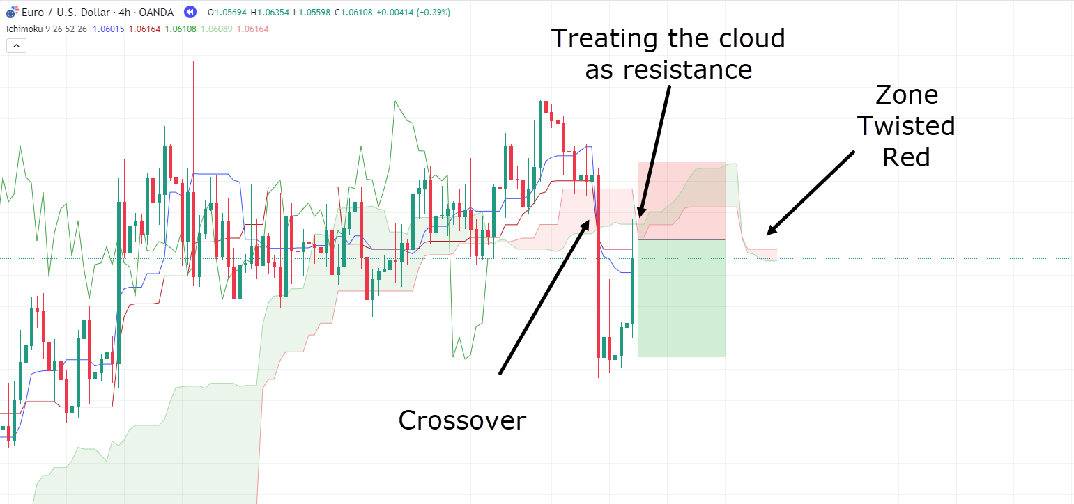
In this case, you have a setup similar to your previous examples.
However, there is one notable difference – your stop loss is somewhat wider than in previous cases.
Let’s assume you entered at the cloud to potentially secure a better entry point…
EUR/USD 4-Hour Chart Entry:
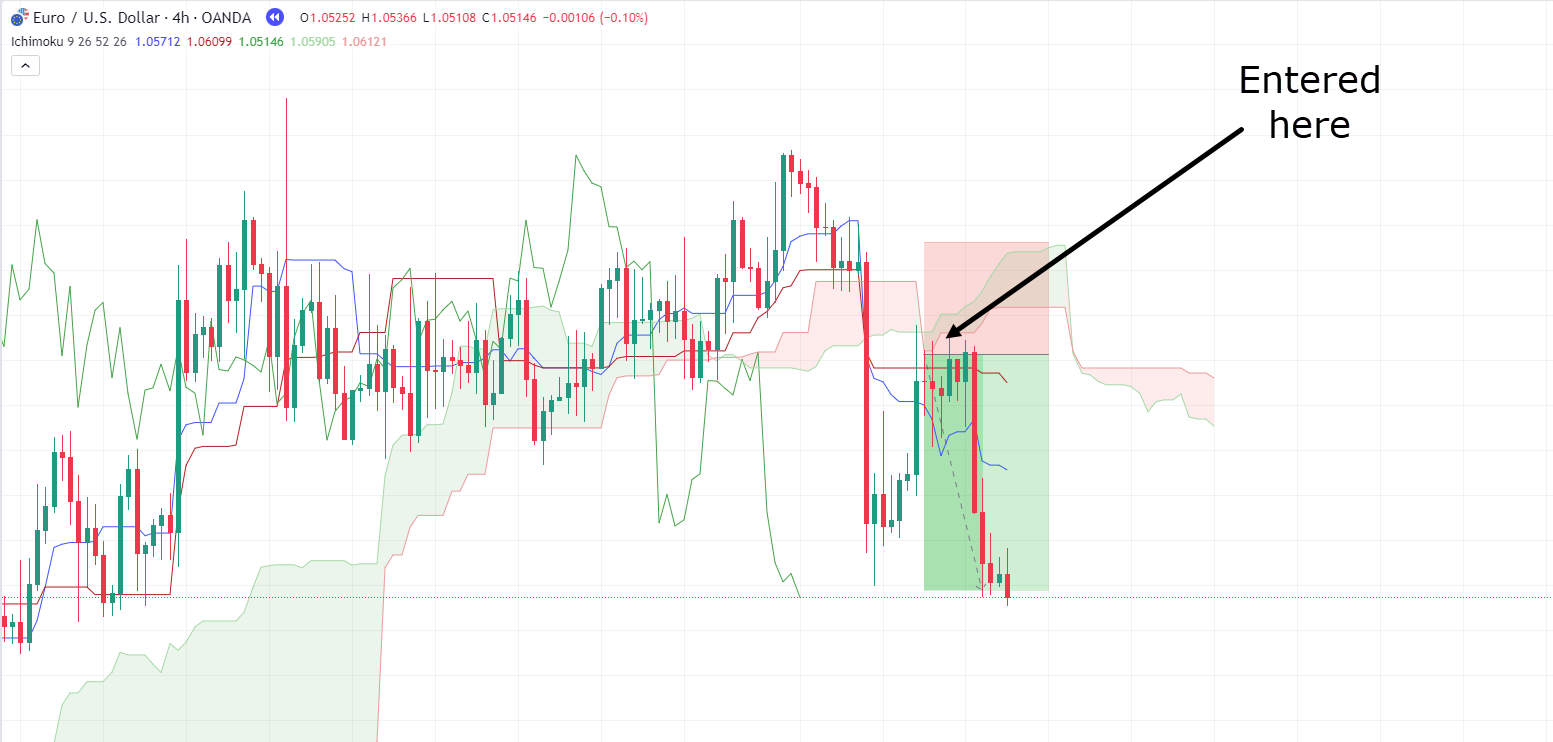
The trade looks promising at this stage!
The price has moved significantly away from your entry point…
Depending on your strategy, you might be considering taking some profits.
However, for consistency, let’s assume you’re sticking with the same system as previously…
EUR/USD 4-Hour Chart Exit:
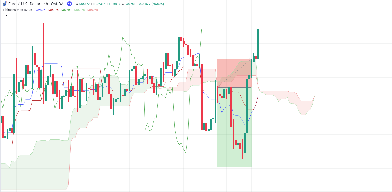
Uh oh! The market experienced a sharp reversal!
But really, such occurrences are quite common in trading…
Sometimes, your trade appears to be progressing favourably, and then the price swiftly returns to your entry-level or stop loss.
As you can see, there were opportunities for you to either take profit or accept a minor loss.
When the substantial bullish candle brought the price back to your entry point, you could have considered taking a small loss and just moving on to another trade…
As it goes, though, the large bullish engulfing candle virtually wiped out most of your trade – in a single, brutal sweep!
It’s a clear indication that momentum is strongly in favor of the bulls, and in such a case, it’s often wise for you to step aside.
The key takeaway here is that while Ichimoku Cloud can provide excellent trading opportunities with momentum on your side, it’s not a foolproof system.
With practice and experience, though, you’ll come to understand that the market provides hints about when it’s best for you to exit a trade early and seek opportunities elsewhere.
Now, let’s address the limitations of the Ichimoku Cloud…
Limitations of Ichimoku Cloud
Clutters the chart
As you might have noticed earlier in the article, when you look at the Ichimoku Cloud chart, it can appear quite busy to your naked eye!
The various lines, colours, and clouds can clutter the chart, sometimes making it challenging to pinpoint what’s happening…
It can be overwhelming for many traders, especially novices.
Overwhelming for Novice traders
Expanding on the previous point, for traders new to the Ichimoku Cloud, it can be confusing.
To effectively trade using Ichimoku Cloud, traders need to practice and understand how the market reacts to the key levels.
Novice traders often find themselves bewildered about which signals to prioritize and when to act.
Potential Mixed Signals
Because Ichimoku Cloud incorporates numerous signals within a single indicator, it can sometimes provide conflicting information.
This is why patience is essential when using Ichimoku Cloud.
Waiting for all the signals to align may take time, but it often serves as a strong confirmation of a bias shift.
Distance from the cloud can complicate trading decisions
One final point to consider regarding the limitations of Ichimoku Cloud is that prices can sometimes move away significantly from a reasonable entry point.
If there’s a sharp price drop, but you aim to enter near the cloud, it might take days or weeks for the price to return to a suitable entry point with a favorable risk-to-reward ratio.
In such scenarios, the best course of action is often to wait or just explore other trade opportunities.
It’s important not to chase profits simply because your trade idea appears promising!
But of course, it’s not all negative!…
Benefits of Ichimoku Cloud
Comprehensive Signal Generator
Ichimoku Cloud stands out for its ability to incorporate a wealth of data, surpassing the capabilities of a traditional moving average.
It essentially functions as a checklist, which becomes easier to understand and follow with experience.
When all the elements align with Ichimoku Cloud, you can confidently enter trades, assured that momentum is firmly on your side!
This feature empowers you to make well-informed trading decisions.
Dynamic Support and Resistance Levels
As mentioned earlier, Ichimoku Cloud introduces traders to a fresh perspective on support and resistance levels.
It offers dynamic support and resistance that adjusts with price momentum.
This dynamic aspect resembles a moving average, but Ichimoku Cloud presents support and resistance in the form of zones rather than a single level or line.
Precise Buy and Sell Signals through Line Crossovers
The crossover between the Base Line and Conversion Line serves as an early warning system for potential market movements.
This early indication allows traders to proactively monitor an asset well before immediate action is required.
Furthermore, these crossovers can also serve as exit signals, enabling traders to exit a trade earlier rather than waiting for all the indicator’s components to turn against their position.
It can help prevent unnecessary profit loss that might occur if an exit is delayed.
Got all of that? Well, let’s sum it up!
Conclusion
In the unpredictable world of trading, having the right tool can make all the difference, and that’s where Ichimoku Cloud shines.
While it may seem complex initially, I hope you can see why it’s a game-changer for traders.
At its core, Ichimoku Cloud’s strength lies in its data-driven predictions.
It’s more than just an indicator; it’s your trading sidekick that simplifies the trading process once you get the hang of it.
When everything aligns with Ichimoku Cloud, you’re on the right track, with momentum on your side.
Ichimoku Cloud offers a dynamic view of support and resistance, adjusting as the market moves.
Ichimoku Cloud’s line crossovers add to its magic, providing early signals for entry and exit – it’s your secret weapon for making well-timed decisions and protecting your profits!
But – keep in mind that even the best tools have their limits.
Ichimoku Cloud isn’t foolproof, it takes practice to know when to exit a trade and explore new opportunities.
In a nutshell, Ichimoku Cloud is your trusty companion for trading, offering insights, predictions, and signals that can elevate your decision-making.
As you gain experience, you’ll uncover the full potential of Ichimoku Cloud and trade the markets with newfound confidence.
Let me know how you use Ichimoku Cloud in the comments below!


