Have you ever meticulously drawn a support or resistance line on your chart, patiently waiting for the price to reach it?
… But when it finally does, and you enter your trade – you can only watch in frustration as the price breezes past your line!
All that effort for nothing!
You might have wondered… with support and resistance being such fundamental aspects of trading, why do I struggle with them so much.
There must be more to it than randomly placing lines on my chart and hoping for a reaction, right?!
Well, here’s the truth.
The market couldn’t care less about your support or resistance lines on your charts!
The reason for this indifference?
It all stems from the laws of Supply and Demand.
Supply and Demand serve as significant driving forces behind market movements.
So if you can unlock the secrets of WHY and HOW they work, you’ll significantly improve your ability to place key levels on your charts – that price responds to!
In this article, you’ll discover:
- What Supply and Demand are so you can trade these zones with confidence!
- How understanding Supply and Demand levels up Support and Resistance trading.
- Discover why a firm understanding of Supply and Demand is indispensable.
- Learn how to spot different types of Supply and Demand zones to tailor your strategy to changing market conditions.
- How to effectively navigate Supply and Demand zones to be in flow with the market.
Sound Good?
Let’s dive into this enlightening journey of Supply and Demand in trading!
What is Supply and Demand?
Supply and Demand are core concepts – frequently referenced in the world of financial markets.
But what exactly do people mean when they talk about supply and demand?
The law of supply and demand is a theory that aims to clarify the relationship between the availability and desire for a product, such as a security, and its price.
In simple terms, prices rise when availability is low and demand is high.
Conversely, prices tend to drop when availability is high and demand is low.
So let’s consider these principles with an example from forex trading…
In forex, if a particular currency receives positive news that attracts buyers, the demand for that currency will increase.
If, at this point, there aren’t enough sellers willing to sell that currency at the current price, buyers may be compelled to purchase it at a premium price.
This dynamic illustrates what I like to call the “flow of supply and demand” and demonstrates how prices in the market respond to these fundamental forces.
Now, you might be wondering, “How do I identify these Supply and Demand zones?”
To clarify, picture a range on a price chart…
AUD/USD 4-Hour Chart Range Example:
So what’s happening here?
As the price approaches the Supply zone, it often pauses and absorbs orders before taking a downward turn.
Imagine this as sellers entering the market, causing Supply to outweigh Demand, pushing the price lower, right?
On the flip side, when the price moves down to the Demand zone, it becomes an area where traders see an opportunity to buy, as it creates a situation where demand surpasses supply.
Predictably, this leads to a price increase from the Demand zone.
You can think of these zones as the boundaries within which traders are willing to buy and sell assets, effectively forming a price range until a new imbalance emerges.
Now, when the price breaks above a Supply zone, you can infer that the Supply at that price level has been exhausted.
Demand is now stronger, making the current Supply price point less significant.
Understanding this concept of Supply and Demand is an invaluable tool, as it enables you to anticipate how prices are likely to react.
Once you begin to grasp what’s happening behind the scenes in the market, it becomes much easier to construct a narrative about what might unfold when prices reach these critical zones.
Taking time to comprehend the principles of Supply and Demand can begin to shed light on why and how the market behaves as it does…
…and isn’t that incredibly valuable!?
Armed with this knowledge, you can step away from feeling like you’re trading blindly.
Instead, you can create a well-laid-out plan and a solid theory supporting your trade decisions!
This can boost your confidence in trading and provide a clear understanding of where prices might bounce when these zones are breached.
Consider this scenario: Imagine marking a key Demand zone a week ago because the price made an aggressive move away from it…
Demand Zone Example:
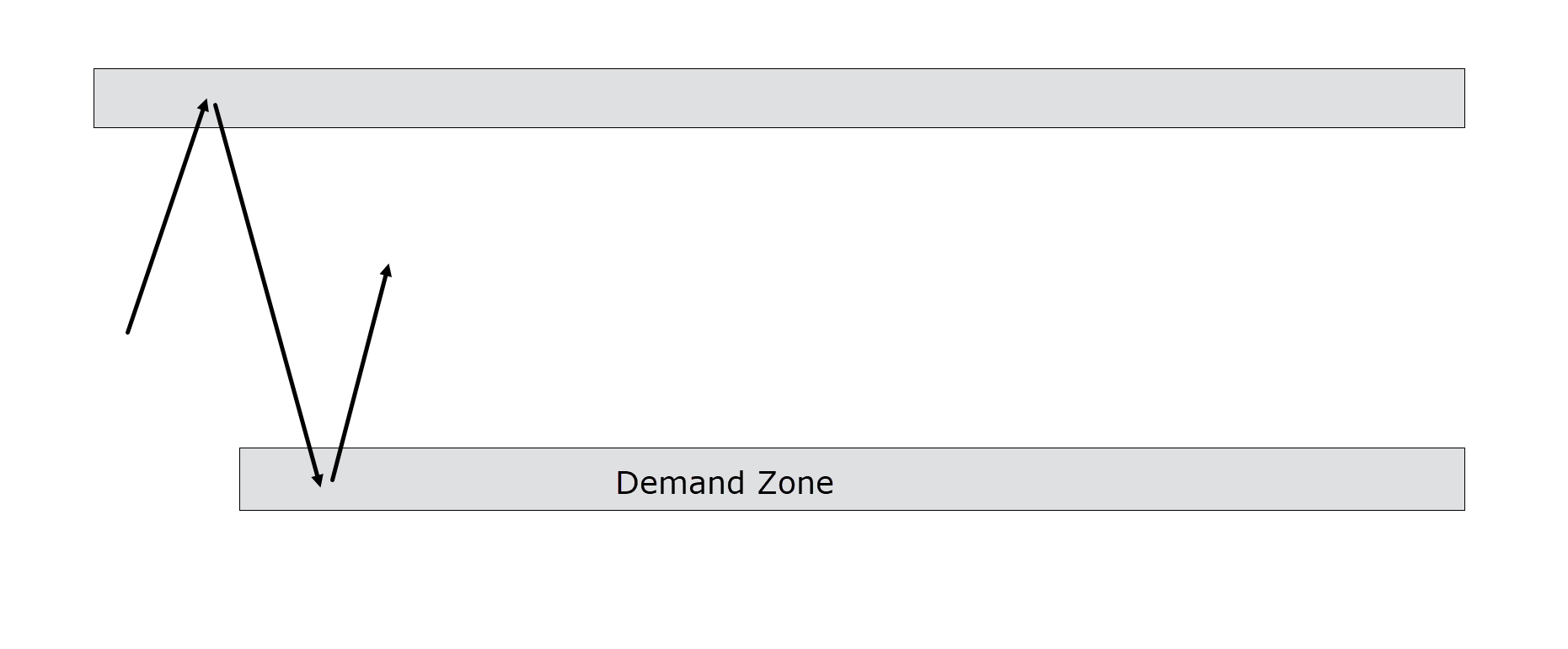
Today, the price has revisited that Demand zone, and you’ve decided to buy the asset. You’ve also identified a Supply zone above the current price, where you expect the price might encounter resistance…
Demand Zone Entry Example:
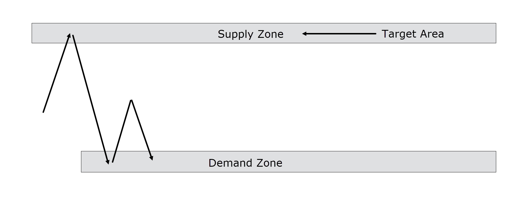
As you monitor the markets over the next few days, you observe that the price approaches the Supply zone and starts to reject it. This serves as your cue to exit the trade, as you recognize that this area likely has a higher Supply-to-Demand ratio…
Supply Zone Exit Example:
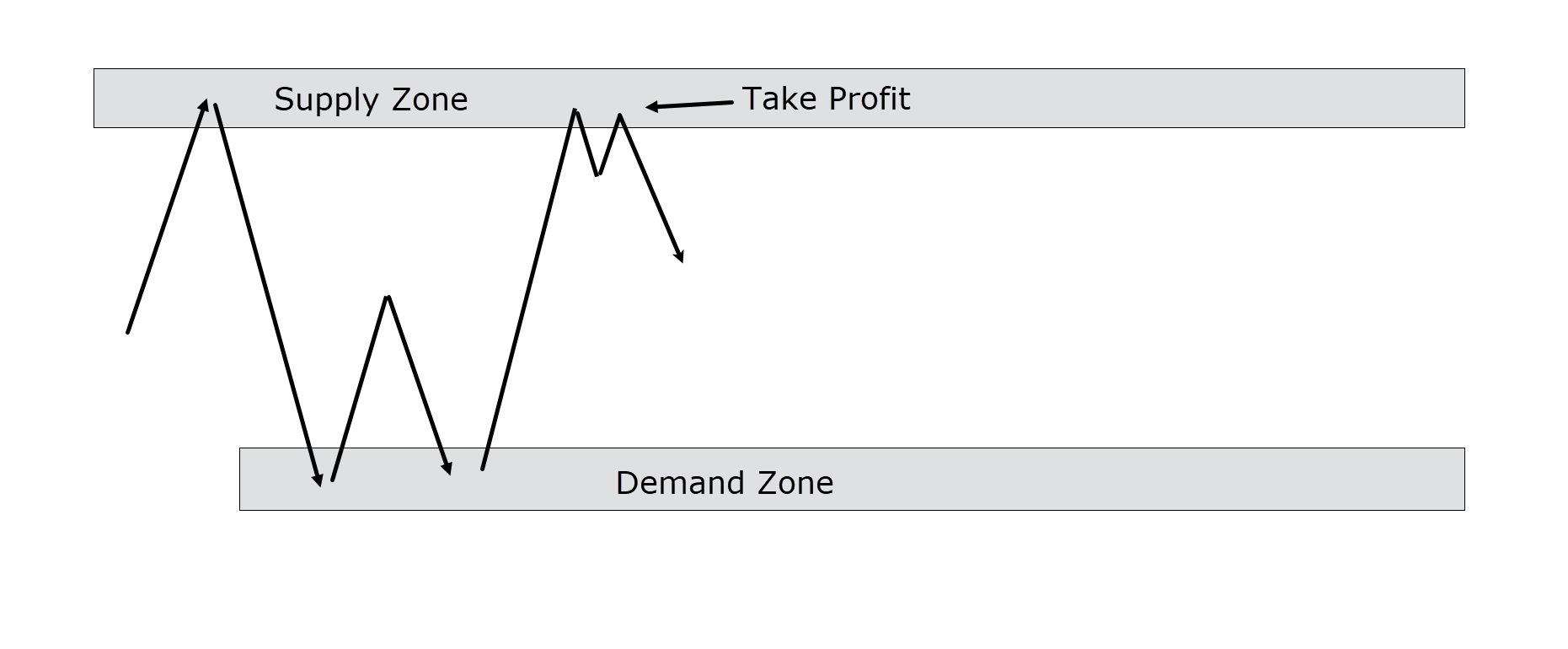
Can you see how this concept keeps you in sync with the market rather than leaving you guessing or out of touch with its dynamics?
But at this point, you might be saying, “Well hang on Rayner, how is this any different from Support and Resistance?”
It’s a good question and in many scenarios Support and Resistance can look very similar.
There are some differences though…
How does Supply and Demand Differ from Support and Resistance?
The most significant distinction between Supply and Demand and Support and Resistance lies in the size of the levels.
The Supply and Demand zones are more expansive areas on the price chart than the specific price levels of Support and Resistance, typically represented as single lines across the chart.
Supply and Demand zones often represent regions where institutional traders have placed a significant volume of buy and sell orders.
Supply and Demand zones are also usually identified by their sharp price declines and inclines.
Although similar concepts, I like to think of major turning points in the market being due to Supply and Demand…
…whereas individual swing highs and lows could be seen as Support and Resistance.
Got it? Great! Let’s look at how to spot them…
How to identify different types of Supply and Demand Zones
This brings me to my next point: the various methods of identifying Supply and Demand zones.
When analyzing charts, I favor three primary Supply and Demand zones.
A well-known Supply and Demand trader by the name of Sam Seiden explains three different easy-to-follow ways of identifying Supply and Demand Zones.
It’s essential to realize that traders often have diverse techniques for delineating these zones, sometimes becoming overly technical in the process!
Sam’s approach is to simplify the process, recognizing that as traders you are merely seeking zones where price reactions may occur.
The precision of drawing these zones isn’t critical – it just has to align logically!
Now, let’s examine all three types of zones with practical examples to illustrate his perspective.
Firstly, you have the Fresh Demand zones.
These zones have recently formed or been established on the price chart. They are deemed more reliable as they have not yet been tested.
Let’s take a closer look at an example of a fresh Demand zone…
Fresh Zones
AUD/USD 4-Hour Chart Fresh Supply Zone:
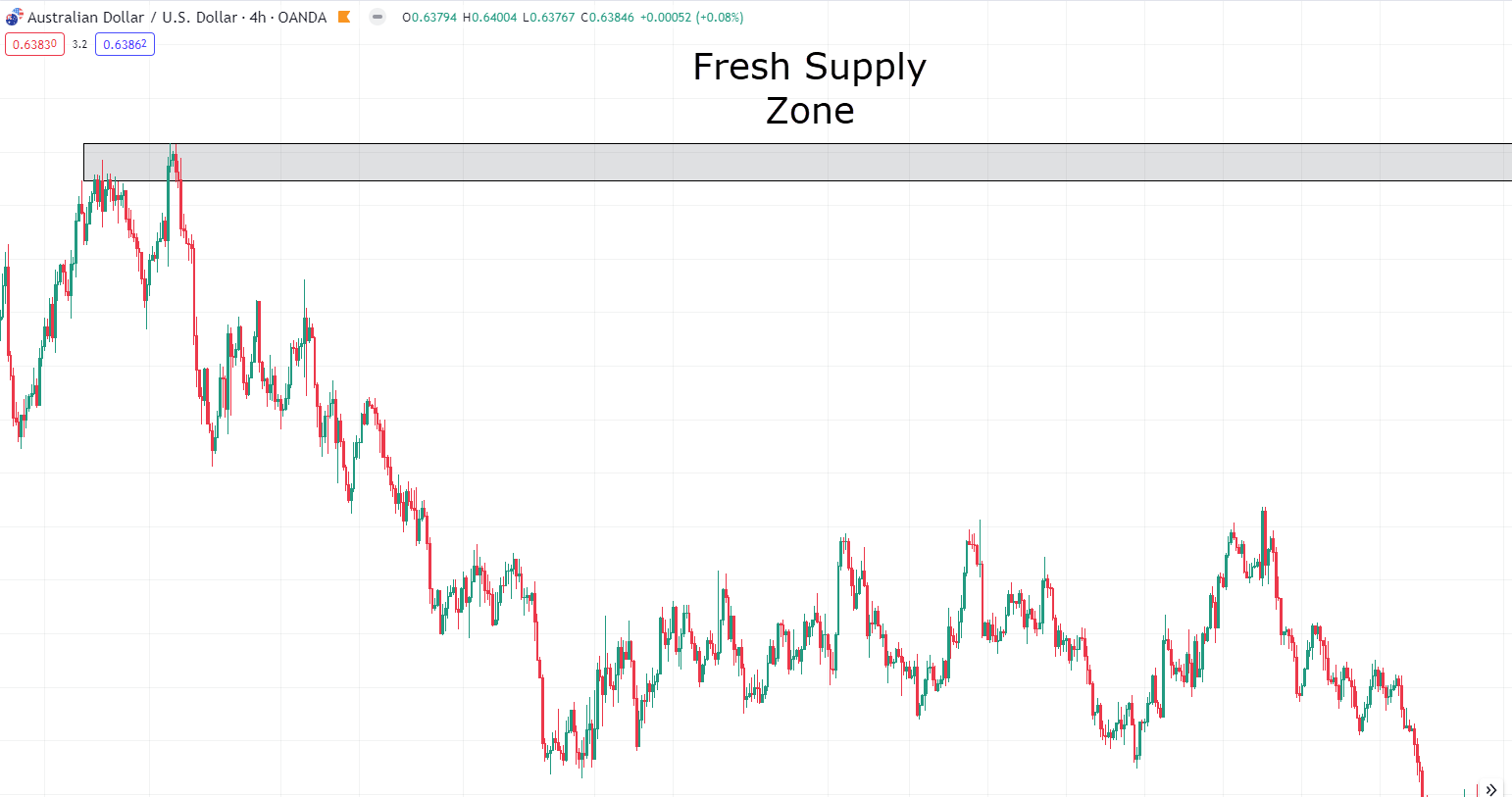
The area marked on the chart represents a zone where prices experienced a rapid decline in the past.
Note how price has yet to revisit this area, which categorizes it as a Fresh Supply zone.
Fresh zones that haven’t been tested are more likely to provoke price reactions compared to zones that have already been tested.
This principle applies similarly to Demand zones, but they can occur at the bottom of a trend, too!
Make sense?
Good, let’s look at the next type of zone…
Rally-Base-Rally (RBR) and Drop-Base-Drop (DBD) Zones
Next, you have the Rally Base Rally (RBR) and Drop Base Drop (DBD) zones.
RBR zones materialize when the price rallies, forms a base or consolidation, and then rallies again.
DBD zones happen when the price drops, undergoes consolidation, and then drops once more.
Now, you might recognize these zones as bull and bear flags or simply as small ranges occurring within trends…
A rose by any other name, right?
Well, regardless of the terminology, I identify them by seeking consolidation phases amid a trend.
Let’s take a look at a Rally-Base-Rally Chart…
USD/CAD 4-Hour Chart Rally-Base-Rally:
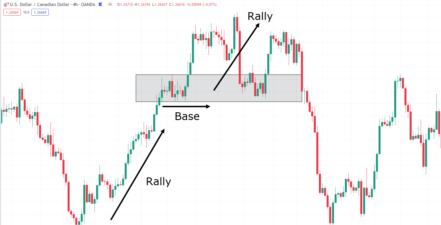
Observe how the price undergoes a rally, followed by a base and consolidation phase.
Subsequently, after breaking above the base, it continues with another rally… before eventually retracing to test the Base Demand zone once more, resulting in a bounce.
Clearly, price reacts to this zone according to the principles of Supply and Demand.
Now, let’s shift our focus to a Drop-Base-Drop chart…
GBP/CAD Daily Chart Drop-Base-Drop:
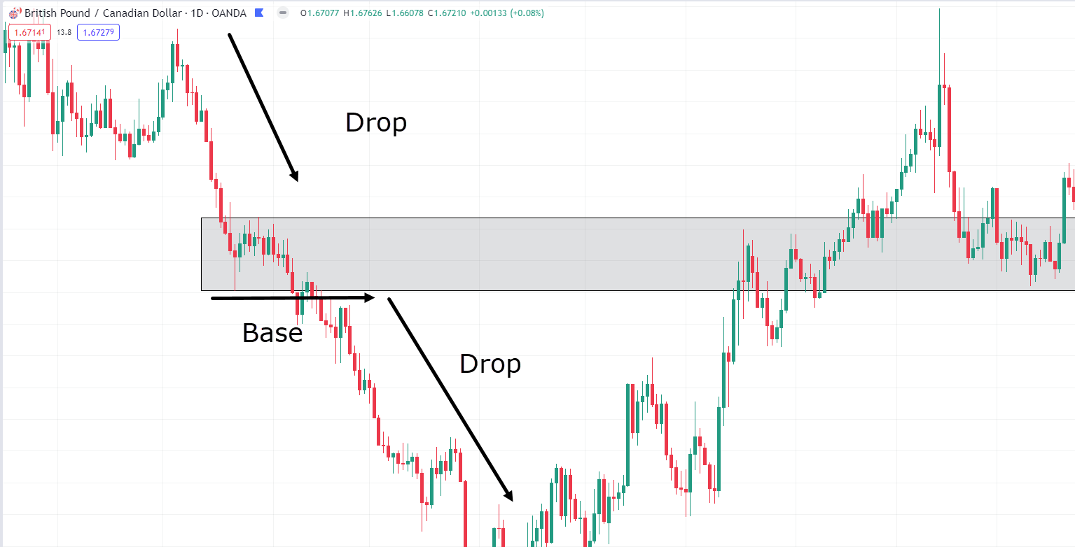
Similar to the Rally-Base-Rally zone, in the Drop-Base-Drop scenario, you can witness an initial strong, high-momentum movement.
This is followed by a consolidation phase before another robust movement, but in this case, it’s to the downside.
It’s important to note that a Drop-Base-Drop zone will always be a Supply zone, whereas a Rally-Base-Rally zone will exclusively form a Demand zone.
Does this distinction make sense to you?
Take a few more moments to grasp what’s going on.
Once you’ve got it, let’s proceed to explore the final type of zone…
Rally-Base-Drop (RBD) and Drop-Base-Rally (DBR) Zones
These are similar to the previous zones discussed and, in some instances, may even resemble fresh zones.
The Rally-Base-Drop zone occurs when the market shifts from an uptrend to a downtrend.
As the base formation completes and prices start to decline from the zone, the Supply zone is formed.
One significant difference between RBD/DBR zones and the previously mentioned zones is that the base or consolidation here can be much less significant.
You don’t necessarily require a formation of multiple candles or extensive consolidation to establish an RBD or DBR zone.
Let’s grab an example of a Rally-Base-Drop zone…
GBP/CAD Daily Chart Rally-Base-Drop:
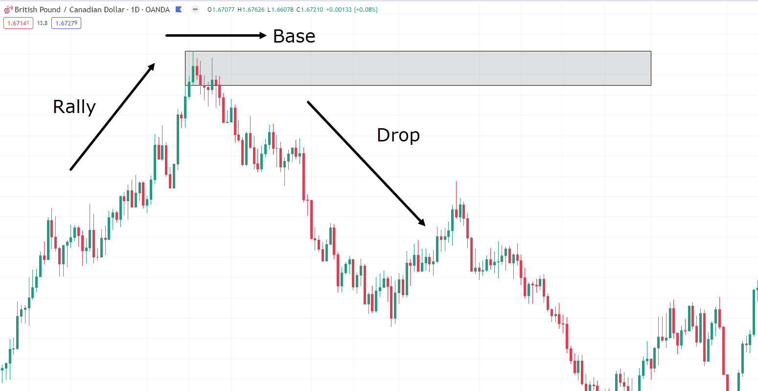
As illustrated here, the price experienced a rally up to the swing high, marking the point where the base formation occurred.
From there, the price declined, forming a downtrend, often called the “drop.”
Now, let’s proceed to explore the final example, a Drop-Base-Rally zone…
EUR/NZD Daily Chart Drop-Base-Rally:
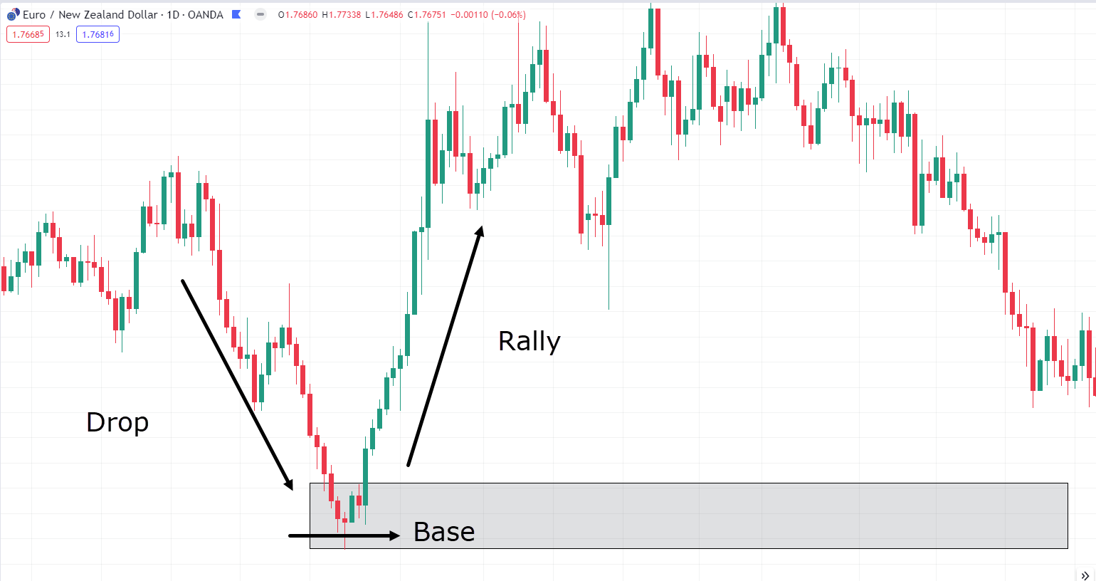
Here, you can observe the Drop-Base-Rally (DBR) zone presented on the chart.
Similar to the Rally-Base-Drop zone, this zone materializes when a trend reversal occurs.
Got all those zones in mind?
Great!
So, now that we’ve covered the distinctions among all the types of Supply and Demand zones, let’s get into a few examples of how to trade them!
How to Trade Supply And Demand
First, let’s examine an example of an RBD zone on the USD/JPY daily chart…
USD/JPY Daily Rally-Base-Drop Example:
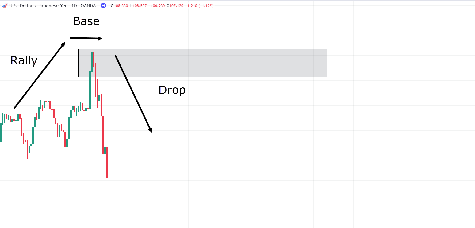
In this example, you can observe that the price underwent a rally, reaching a peak before experiencing a significant sell-off.
With our newly minted knowledge of Supply and Demand dynamics, you can deduce that this is the zone where supply overpowered demand, right?
Consequently, you can anticipate that if the price revisits this area, you might witness selling pressure again.
Let’s see what happens!…
USD/JPY Daily Chart Trade Example:
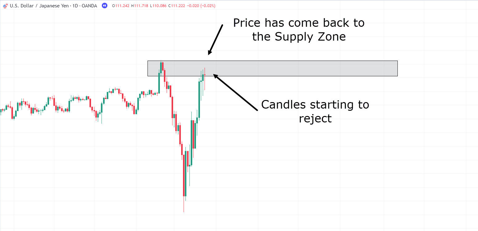
You can observe a shift in the candles’ behavior as the price revisits the zone, right?
Initially characterized by strong momentum, they evolve into smaller-bodied candles, indicating a struggle between buyers and sellers in this crucial area.
This presents a compelling reason to consider taking a trade!
Price has returned to our Supply zone and appears to be stalling again.
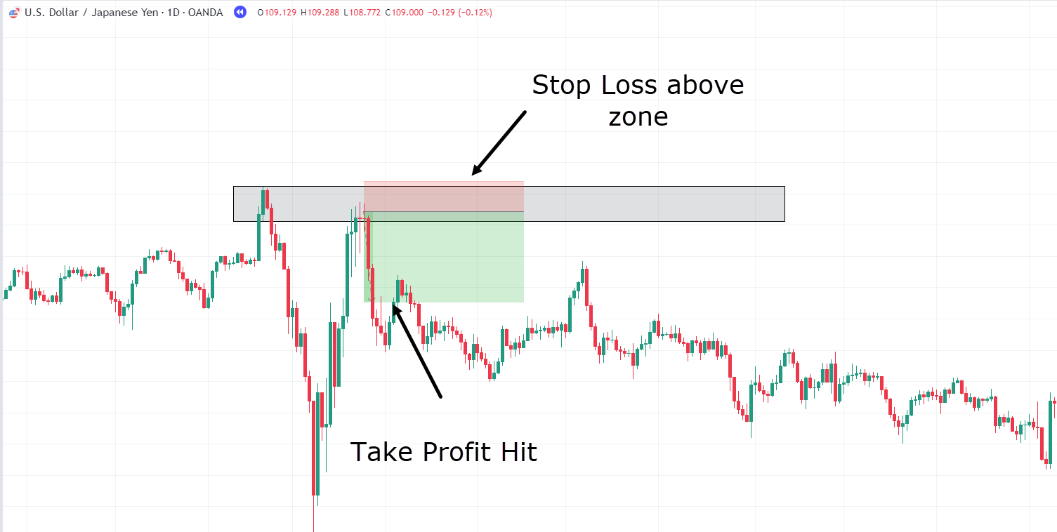
In this particular example, let’s initiate a short trade with a target of achieving a 1:3 risk-reward ratio (RR)…
USD/JPY Daily Chart Trade Example:
Excellent!
Price reached the 1:3 risk-reward ratio, and profits were successfully captured!
In this trade, the stop loss was positioned just above the zone.
However, this placement can always be customized – to align with your personal risk tolerance and trading guidelines.
Similarly, take-profit levels can be adjusted, potentially based on past Demand zones, depending on your desired trade duration and strategy.
Now, let’s shift our focus to another trade, this time involving a Demand zone…
USD/SEK Daily Chart Trade Example:
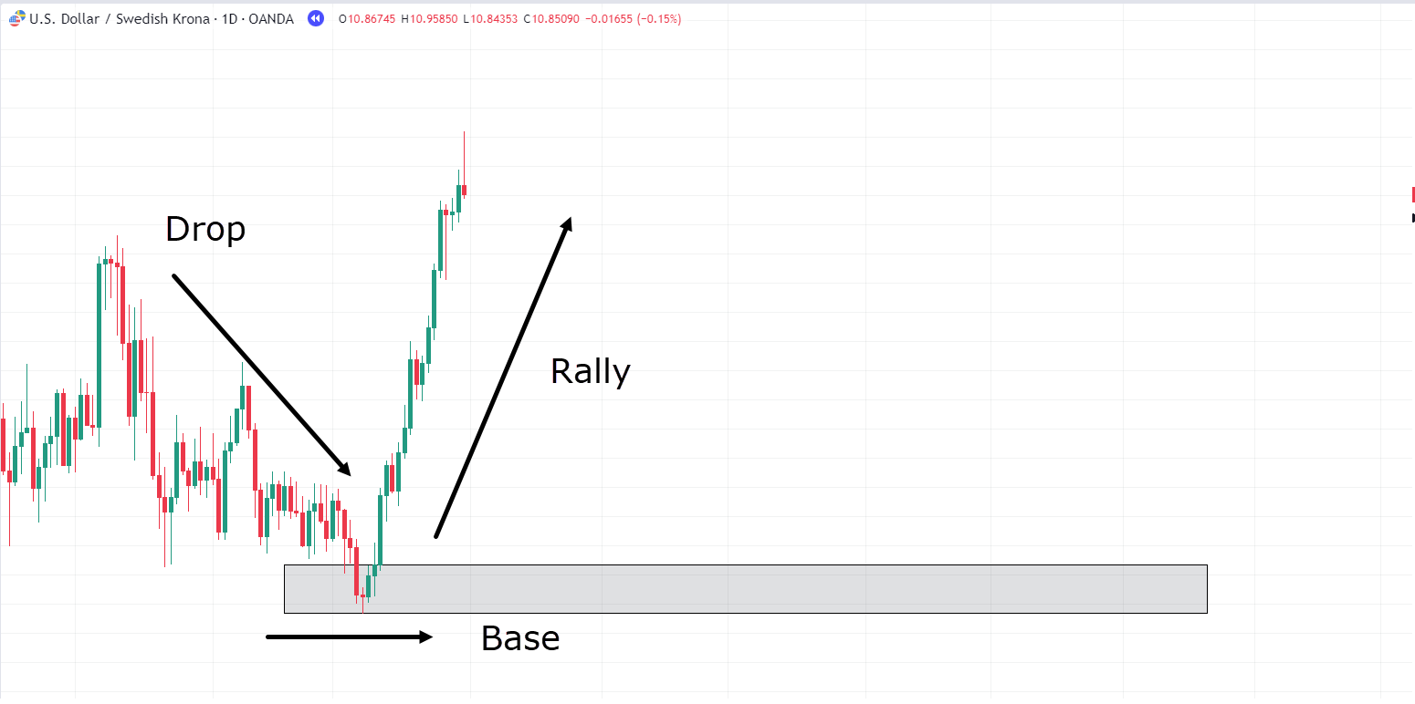
In this scenario, you have identified a fresh Demand zone following the Drop-Base-Rally formation.
The strategy here is to exercise patience and wait for the price to revisit this area, exhibit signs of rejection, and then initiate a trade…
USD/SEK Daily Chart Trade Entry:
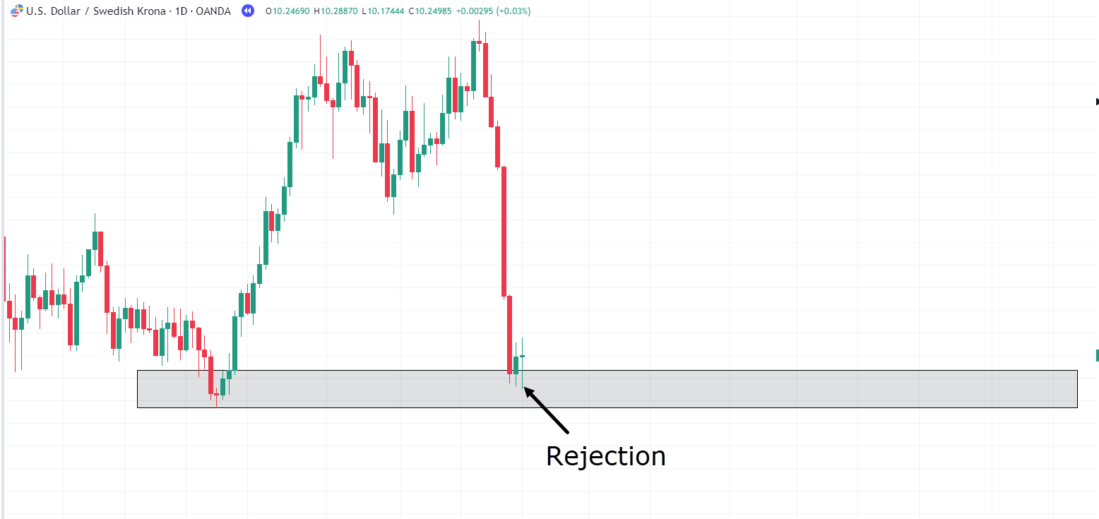
Indeed, the price has retraced to our identified Demand zone and is displaying signs of rejection.
However, before you execute this trade, let’s revisit the knowledge you’ve gathered.
The market often moves fluidly and has the potential to reach the previous Supply zone; why limit yourself to a 1:3 risk-reward ratio?
So, in this instance, let’s set our sights on the Supply zone as our target, positioning our stop just below the Demand zone, and observe how the trade unfolds…
USD/SEK Daily Chart Trade Exit:
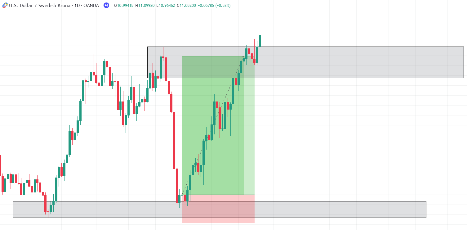
Isn’t it fascinating?
It often appears that the price is magnetically drawn to these zones… almost like clockwork!
This is where the true potential of Supply and Demand comes to the fore.
It offers clear-cut targets and entry points, all underpinned by sound reasoning drawn from the laws of Supply and Demand dynamics.
Now, let’s jump into one more example to ensure you have a well-rounded understanding of realistic expectations…
CAD/JPY Daily Chart Trade Example:
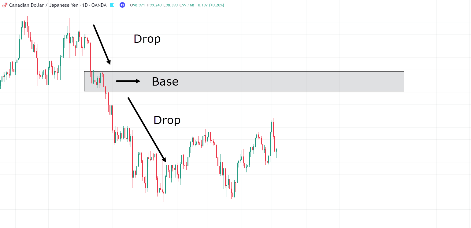
Consider this Drop-Base-Drop illustration.
Similar to our earlier examples, this zone has materialized due to a consolidation phase following robust, high-momentum price movements.
If the price revisits this Supply zone, you can contemplate taking a short trade, following the principles discussed…
CAD/JPY Daily Chart Trade Entry:
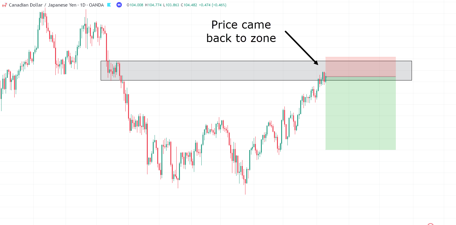
And look at that! Price has revisited your designated zone, offering you a prime opportunity to enter a short position in the market.
Now, let’s patiently observe how this trade unfolds…
CAD/JPY Daily Chart Trade Stop Hit:
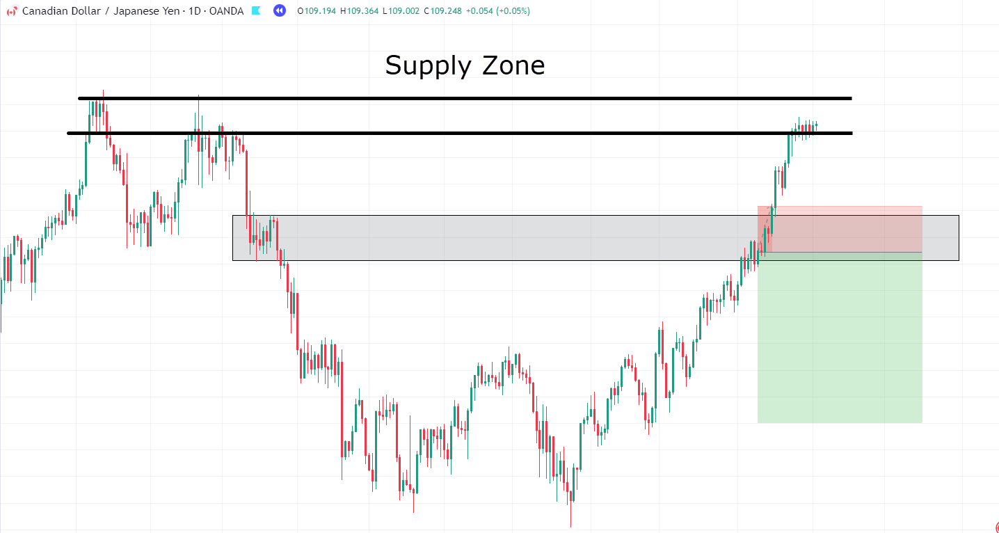
Uh-oh! Price has surged past your stop loss, causing a hiccup in this trade.
However, it’s worth noting where the price has ventured next – it’s intriguing how it has gravitated toward this upper region. This area happens to be an untested Supply zone!
If you examine the candlestick patterns closely, you’ll notice the emergence of small-bodied candles and signs of rejection…
…this could be the formation of a base, don’t you think?
Let’s take this trade as well!…
CAD/JPY Daily Chart Trade Re-Entry:
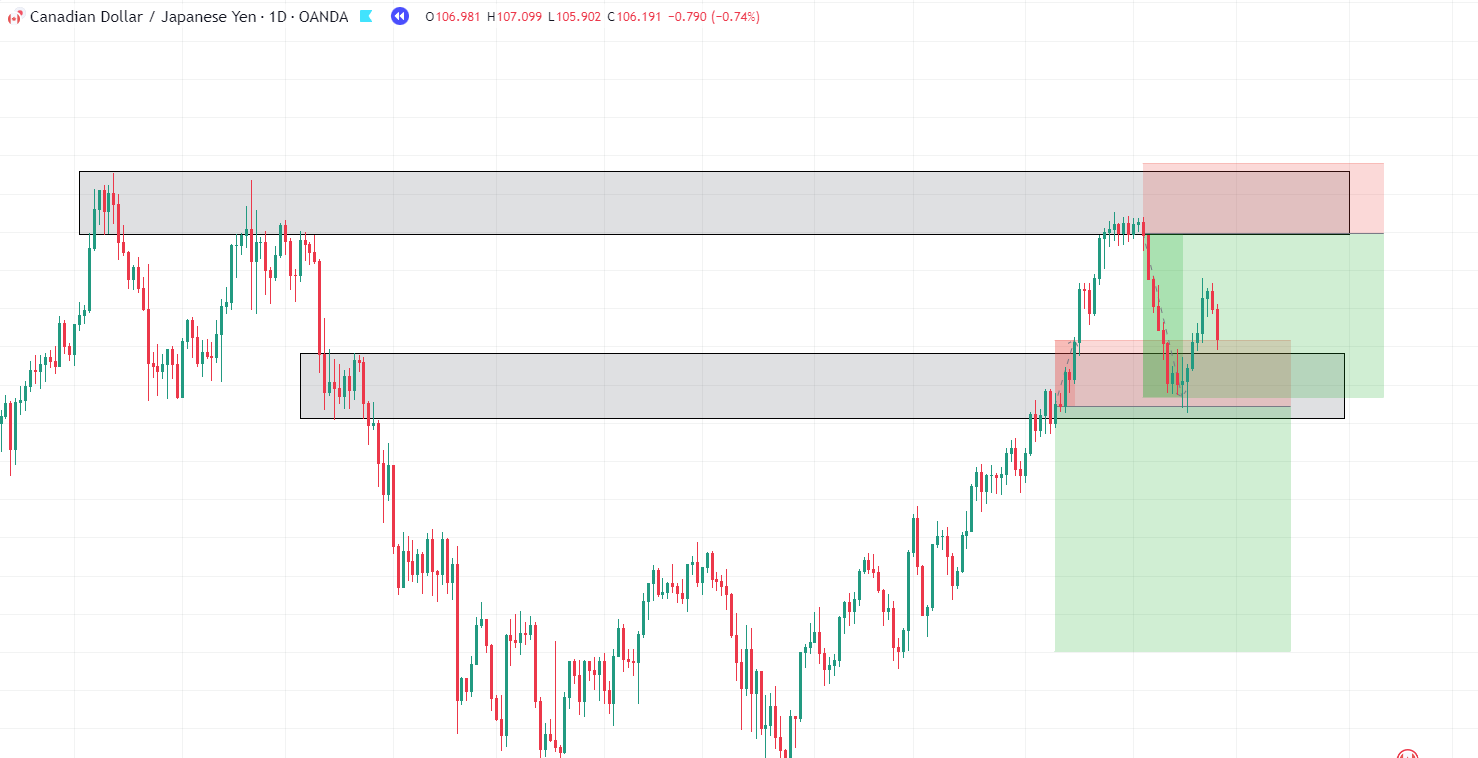
Indeed, it’s intriguing how the price didn’t adhere to the first zone but was instead drawn to the higher Supply area.
Your initial trade might not have gone as planned, but your awareness of the potential higher Supply zone allowed you to secure a winning trade, thanks to your grasp of the laws of Supply and Demand.
This scenario highlights the fact that not all zones will be treated equally.
Depending on various factors like news, market activity, and trading sessions, zones can be continually established, breached, and re-established as the market naturally progresses from one area to the next.
As a trader, your mission is to uncover these zones and execute trades based on the sound principles of Supply and Demand, capitalizing on price reactions at your designated zones.
Conclusion
The relationship between Supply and Demand is closely linked to what many traders refer to as Support and Resistance.
However, people often get caught up in debates over precise definitions and the “right” way to draw these levels or zones… which misses the fundamental concept of Supply and Demand.
Nonetheless, here’s what you have discovered in this article…
- You’ve uncovered how Supply and Demand provides a deeper understanding of why and how price moves on the chart.
- Supply and Demand offer larger areas where price might experience rejection, in contrast to traditional support and resistance strategies.
- Supply and Demand is a fundamental aspect of the markets, shedding light on why price gravitates to specific areas on the chart.
- You’ve explored various types of Supply and Demand zones, including Fresh zones, Rally-Base-Rally, Drop-Base-Drop, Rally-Base-Drop, and Drop-Base-Rally zones.
- Lastly, you’ve delved into how to navigate Supply and Demand zones when your trade doesn’t proceed as planned.
Once you’ve honed these skills, you can delve deeper into the science behind Supply and Demand in your trading journey.
How about you?
What do you think about Supply and Demand?
Do you now see how Supply and Demand differ from Support and Resistance?
How do you trade Supply and Demand?
Let me know in the comments below!


