Ever wondered how some traders always seem to be in sync with the market?
Do they have a mystic ability to predict where the price is headed next?
Although it might seem supernatural, there are really no miracles taking place…
Their secret lies in using tried-and-tested techniques like multi-timeframe analysis (MTA) to better understand why the market is moving in a certain direction.
Once traders master the art of analyzing multiple timeframes, they get a clearer, more accurate picture of the market—leading to smarter, more profitable decisions.
At first glance, MTA might seem overly technical or overwhelming, but once you grasp the core principles, it can make a huge difference in how you approach the market.
In this article, I’ll break down the essentials of multi-timeframe analysis and show how this approach can dramatically improve your trading.
By reading to the end, you’ll learn to spot high-probability trade setups and avoid common pitfalls.
Here’s what you’ll cover in detail:
- What is Multi-Timeframe Analysis?
- The factor of 4 to 6: Choosing the right timeframes
- Using price patterns in MTA for better trade entries
- How to identify stacked levels for stronger trade setups
- Limitations of Multi-Timeframe Analysis
Ready to enhance your trading strategy?
Let’s dive in!
What is Multi-Timeframe Analysis?
Well, it’s all about looking at price movements across different timeframes to help you make smarter trading decisions.
Instead of focusing on just one chart, you’re zooming in and out, looking at both the big picture and the finer details.
It’s a bit like having both a telescope and microscope with you at the same time!
Using this technique, you get a much clearer idea of overall market trends, key support and resistance levels, and where the price might be headed.
Combining different timeframes is a great way to better time your trades, whether you’re getting in or out.
Why Use Multi-Timeframe Analysis
The whole idea is to get a fuller picture.
Instead of relying on just one chart to make a decision, you’re getting confirmation across multiple timeframes, which helps you avoid false signals.
Imagine this: You see a breakout on the 4-hour chart and think it’s time to jump in…
NZD/USD 4-Hour Chart:
Looks like a great breakout, right?
But what if you zoomed out a bit first and looked at the daily picture?…
NZD/USD Daily Chart:
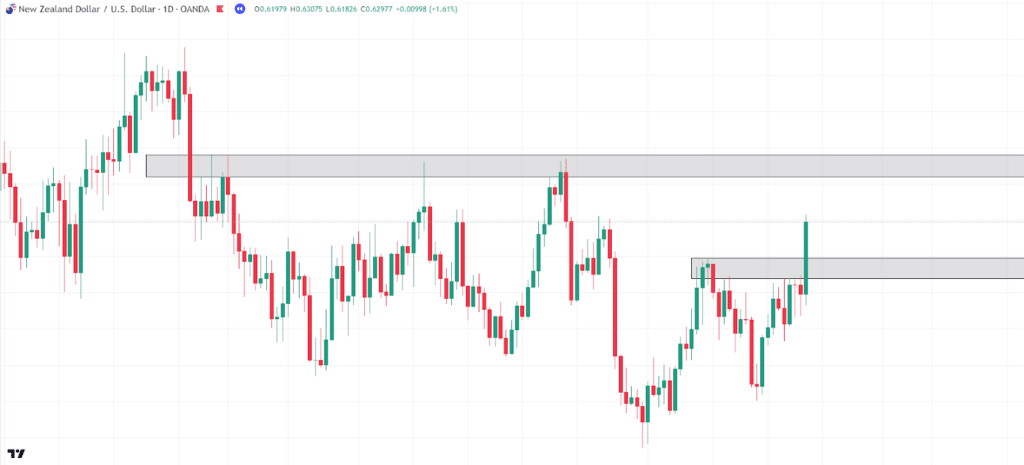
Can you see that the price is approaching a daily resistance level soon?
While there could be a possible trade from the setup you’ve found, it might not be the best since you’d be buying just before a strong daily resistance zone.
Let’s see what happens next…
NZD/USD 4-Hour Chart Daily Resistance:
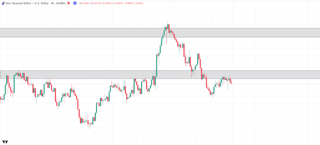
Look at that.
Price rejected the daily resistance area and fell back to its original support level!
See how MTA helps you avoid getting caught in a bad trade?
By syncing up with the overall trend and larger support and resistance zones, you give yourself the best chance to avoid low-quality setups and wait for high-quality ones.
Multi-Timeframe Analysis: A factor of 4 to 6 for a Higher Timeframe
Here’s how you figure out which higher timeframe to use.
I like to keep it simple by using a factor of 4 to 6.
That means you take the lower timeframe you’re trading on and multiply it by 4 to 6 to get your higher timeframe.
For example, if trading on a 1-hour chart, you could use the 4-hour chart for the bigger picture.
If you’re working off a 5-minute chart, you might go up to the 30-minute chart.
This approach helps you stay in sync with the overall trend while still getting the details you need for precise entries and exits.
By sticking with a factor of 4 to 6 for multi-timeframe analysis, you can avoid getting lost in the noise of lower timeframes, too.
However, it’s worth noting that some traders who work with lower timeframes, such as the 5-minute or 15-minute charts, may still find value in analyzing the daily and 4-hour charts, too.
These higher timeframes can provide useful reference points for where the price might be attracted throughout the trading day or week.
Higher Timeframe: What to Look For
You might be asking, “Okay, so what should I even be looking for on the higher timeframe?”
Well, the higher timeframe is like your map.
It shows you key areas such as support and resistance levels, consolidation zones, and previous highs and lows—places where price might react in the future.
Let’s look at some examples of what to look for on a higher timeframe using the daily chart…
AUD/NZD Daily Chart:
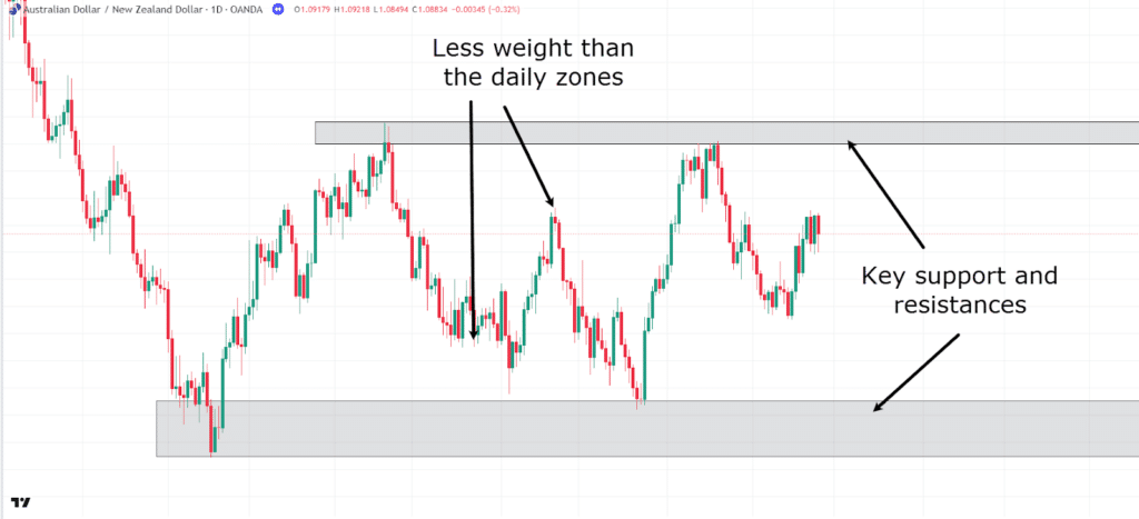
In this example, you can see two clearly defined support and resistance zones.
While there are smaller peaks and lower timeframe support levels, these two zones are acting as the main magnets for price.
Keep it simple and focus on price returning to these zones rather than getting caught up in the smaller timeframe highs and lows.
Let’s look at another example…
AUD/NZD Daily Chart Channel:
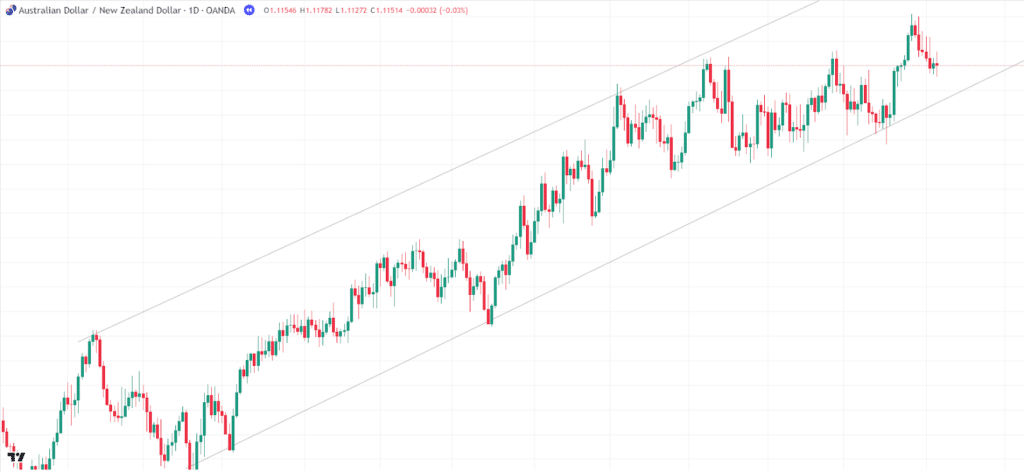
On the daily chart, you can see that the price is moving within an uptrend channel.
This channel gives great insight into where prices might continue heading, too.
As such, it’s important to align your bias with buys if you’re looking to capitalize on this uptrend while also recognizing that there may be an upper boundary.
The top of the channel could provide brief sell opportunities.
Now, I want to show you one more key use for the daily timeframe, which often gets overlooked.
As higher timeframes hold more weight, it makes sense that candlestick formations hold more significance on these timeframes, right?…
AUD/NZD Daily Chart Candlesticks:
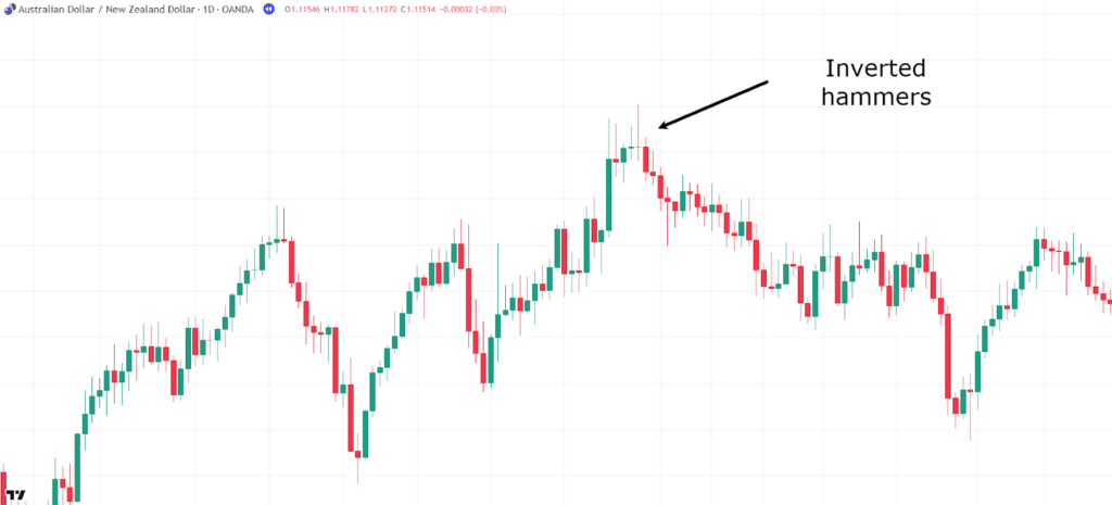
When you look at this chart, you’ll notice that as the price reaches this peak, there are clear inverted hammer candlesticks, indicating significant rejection over several days.
This tells you that price isn’t just briefly rejected for an hour or so—it’s being held at this level day after day.
So, the chances are that prices will retrace when the daily patterns suggest they will.
This can provide invaluable information, whether you’re in a long trade looking to exit at the best possible area or considering a new buy or sell position.
These candlestick patterns could be the final piece of information you need to decide whether to execute the trade.
Now that you have three clear examples of what to look for on the higher timeframe, what should you be looking for on the lower timeframe?
Multi-Timeframe Analysis: Aligning with the Higher Timeframe (Trading Timeframe)
This is where you make your moves.
But here’s the key: You’ve got to align your trades with what’s happening on the higher timeframe.
If you don’t, you’re basically flying blind!
One of the best strategies is to look for stacked levels, which I’ll cover later on in this article.
Now, this timeframe is all about being patient…
Remember how I showed you earlier that certain levels act as magnets? You need to wait for the price to be drawn to these key areas of value.
When support or resistance lines up on both your trading timeframe and the higher timeframe, that’s a high-probability zone for the price to react…
…and this is where you want to be watching for your entry signals!
Let’s take a look at how price reacts at some previously identified daily levels on the 4-hour chart…
USD/CAD Daily Chart:
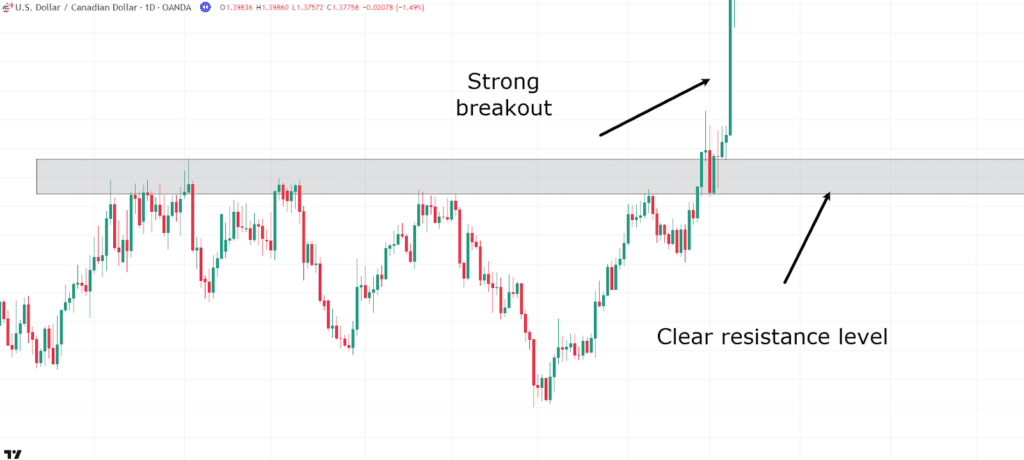
It’s a USD/CAD daily chart where the price has recently broken out.
I want to show you what happens in the lower timeframe when the price eventually comes back to this level.
Let’s fast forward and drop down to the 4-hour timeframe to see what occurs…
USD/CAD 4-Hour Chart:
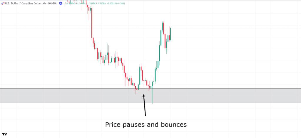
See how the price returned to this magnet level, paused, and then eventually continued back up?
This isn’t just a coincidence. This daily level was a strong area of value, and it’s where attention should be focused while waiting for an entry trigger to initiate a trade.
Strong bullish hammer candles here would have provided a great entry trigger.
So, can you see how being patient and waiting for both the 4-hour and daily charts to align would have helped you capture this move?
Multi-Timeframe Analysis: Break of Structure in the Direction of the Higher Timeframe
It’s clear now why it’s important to always trade in the direction of the higher timeframe.
One way to confirm this is by looking for a break of structure on your trading timeframe that matches the trend on the higher timeframe.
If the higher timeframe shows an uptrend, you’ll want to see a break above a recent swing high on the lower timeframe to confirm that the trend is continuing.
The same goes for a downtrend—wait for a break below a recent swing low to ensure you’re not trading against the tide.
By waiting for these breaks of structure, you’re aligning with the market’s overall direction and giving yourself a better chance of catching the bigger moves.
Let’s take a look at this concept…
USD/JPY Daily Chart:
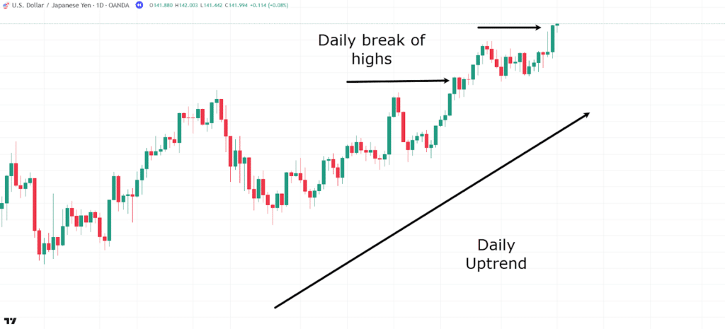
Here, you have a clear daily uptrend, as the price is making a series of higher highs and higher lows.
As the price breaks the highs, I want you to also notice the type of candles that appear after the break.
To do this, let’s go down to the trading timeframe of the 4-hour chart and see what it looks like in more detail…
USD/JPY 4-Hour Chart:
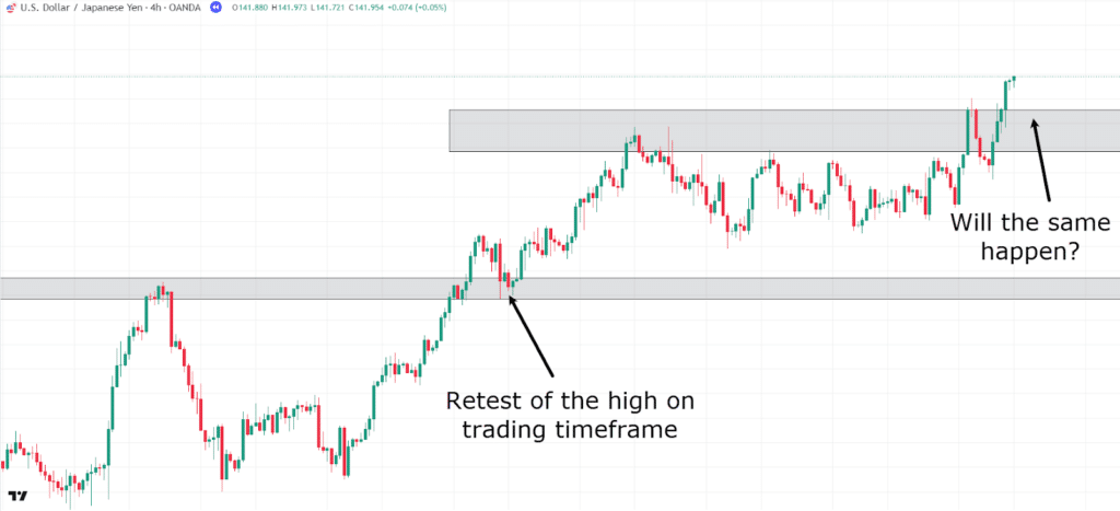
Notice how when the price breaks the high on the daily timeframe, you have confirmation of the trend continuing in favor of the overall direction.
However, this doesn’t always present an immediate opportunity to enter a trade.
It does, however, provide a trading opportunity if the price makes a brief pullback.
In the first instance, the price broke the daily high, and on the daily chart, the daily candle closed above the high, confirming a new higher high.
When the trend continues with momentum, the highs often don’t just slightly break the previous high; they form a significant new high.
So, looking for an entry on the timeframes below can often still provide great trading opportunities.
Let’s take a look at what happens the second time…
USD/JPY 4-Hour Chart Retest:
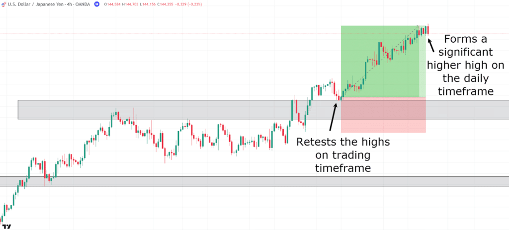
The retest occurs on the trading timeframe, and then price moves to form a new higher high on the daily timeframe.
This technique comes with its risks, as you aren’t technically buying at the swing low of the daily chart.
However, it provides you with confirmation that the daily momentum wants to continue upward.
If you can find an entry opportunity on your trading timeframe that gives clear points for entries and exits, it might be worth considering a trade.
Below is what the successful trade looks like on the daily timeframe chart…
USD/JPY Daily Chart Trade Outcome:
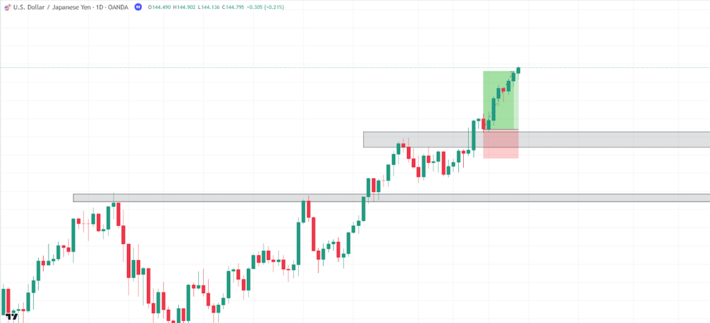
Got it?
Great!
Next, I want to discuss price patterns across multiple timeframes, as this is an extremely useful tool for potentially capturing the start of new higher timeframe trends!
Price Patterns in Multi-Timeframe Analysis
This is another powerful tool that can assist your trading approach.
Price patterns are like roadmaps; they give you clues about what might happen next in the market.
When you combine these patterns with multi-timeframe analysis, it can greatly enhance your ability to find better trade setups.
Breaking it down: if you notice a price pattern forming on a higher timeframe, like the daily or weekly chart, it’s usually a sign of something bigger happening in the market.
Classic patterns like head and shoulders, double tops, or triangles often carry more weight on these higher timeframes, as they reflect broader market sentiment and usually involve a larger number of traders.
Here’s where MTA comes in handy, as you can zoom in to a lower timeframe, like the 4-hour or 1-hour chart, to fine-tune your entries and exits.
For example, if a double bottom is forming on the daily chart, that’s a strong reversal signal.
Instead of entering the trade immediately, you can wait for the price to break a key level or confirm the reversal on a smaller timeframe.
This way, you’re not just reacting to the pattern; you’re being patient and letting the market provide a cleaner entry point.
Another great benefit of using multi-timeframe analysis with price patterns is that it helps you avoid false signals.
Patterns on lower timeframes, like a 5-minute or 15-minute chart, might look promising, but they can often be noise in the larger market picture.
If those patterns don’t align with what’s happening on a higher timeframe, they might not be worth trading at all.
By aligning patterns across different timeframes, you increase your odds of success and avoid getting caught up in short-term market fluctuations.
In short, combining price patterns with MTA gives you a strategic edge.
Let’s take a look at an example…
GBP/USD 4-Hour Chart:
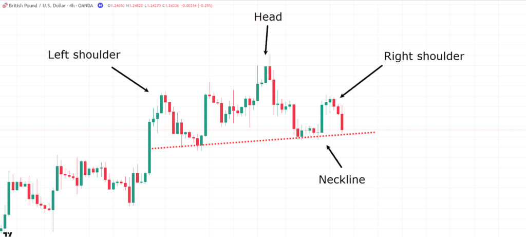
Imagine you identified a head and shoulders pattern on the 4-hour timeframe during your higher timeframe analysis.
It looks like a great chance to jump down to your trading timeframe chart and look for any indications that price might move down from this pattern.
You can have confidence knowing that the higher timeframe analysis aligns with your short bias on the lower timeframe.
So, let’s see what happens…
GBP/USD 1-Hour Chart:
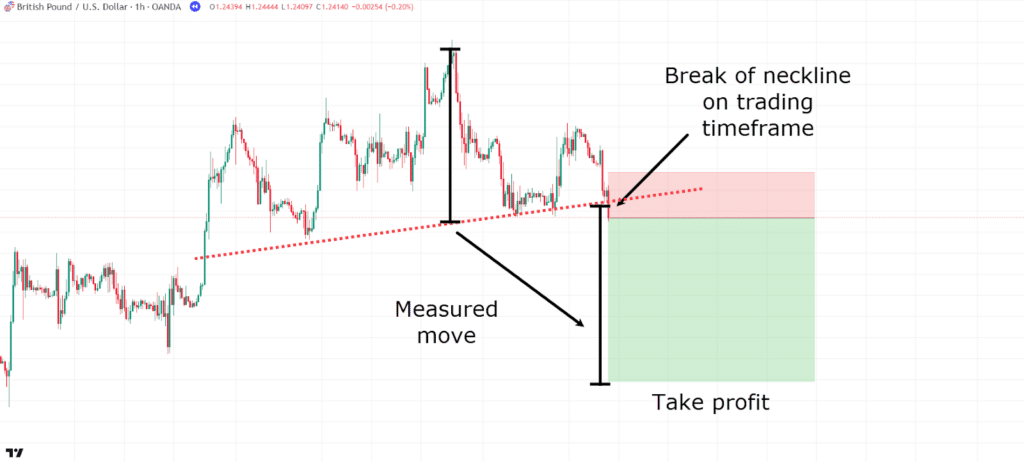
Price breaks the neckline on the lower timeframe, presenting an opportunity to get in at the start of the move.
For the take profit, let’s use the measured move of the neckline-to-head distance, and for this example, set the stop loss above the neckline, where the trade would become invalid.
Let’s take a look at what happens…
GBP/USD 1-Hour Chart Trade Outcome:
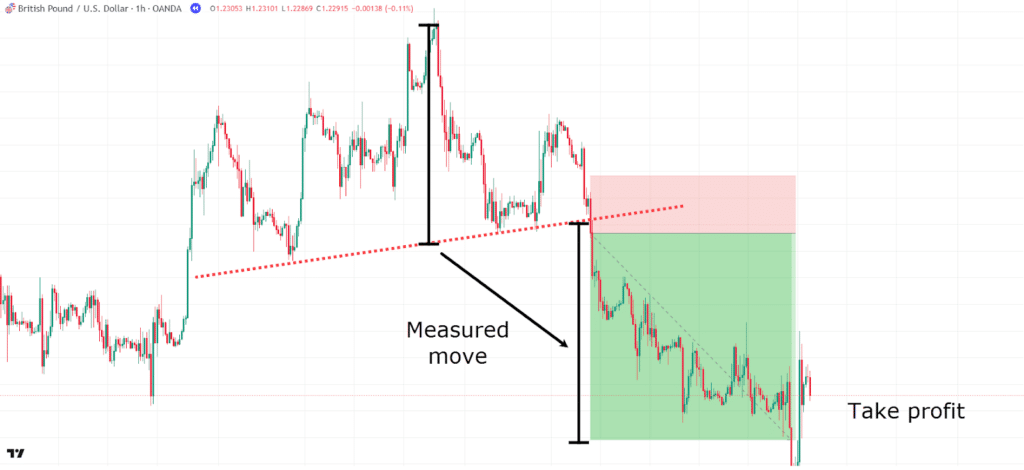
Wow! A nice 3.5RR trade.
Not bad, considering you were able to take the trade knowing the higher timeframe aligned with your entry.
What becomes apparent through this example is that the higher timeframe serves as a reminder of where price might be in the bigger picture.
It allows you to execute trades on your trading timeframe with much more confidence, knowing that the broader picture aligns with your entry trigger while also enabling you to enter at the start of patterns to capture as much of the move as possible.
Finally, let’s touch on the advanced concept of stacked levels.
Multi-Timeframe Analysis: Stacked Levels
Alright, here comes stacked levels!
This is when you spot major support and resistance zones across multiple timeframes.
It’s like finding an intersection where two roads meet – only here, it’s where price levels overlap.
Let’s look at an example…
USD/CAD 4-Hour Chart:
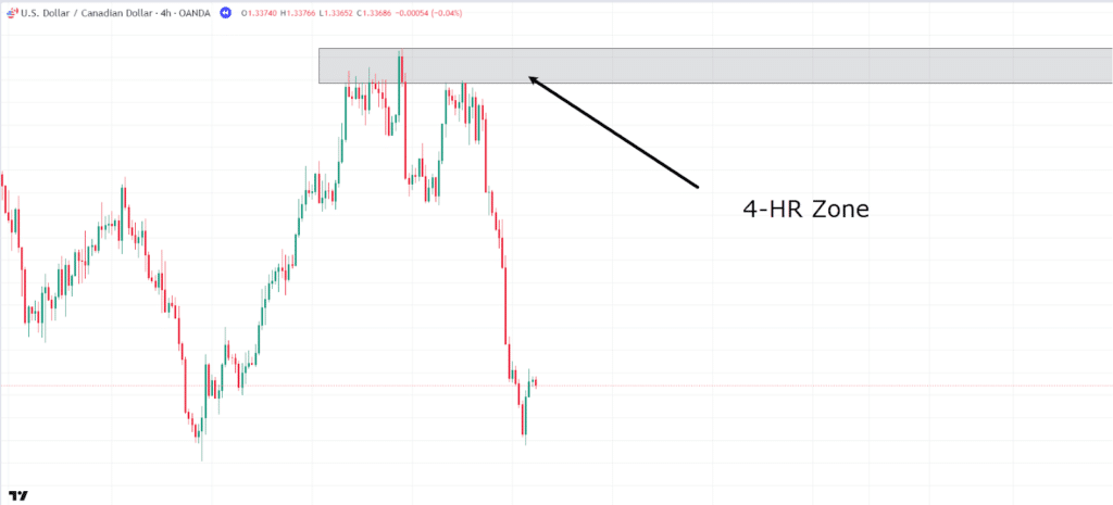
Say you see a resistance level forming on the 4-hour timeframe, but you’re unsure if it will hold much weight going forward.
Let’s check the daily chart, which could be your higher timeframe (HTF), and see what it shows…
USD/CAD Daily Chart:
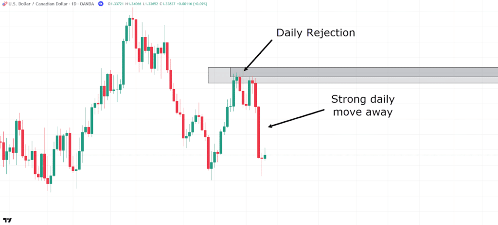
As you can see, the level is clear on the daily chart as well.
There’s a bearish rejection candle at the zone, followed by a strong move away.
This level has become significant and is an area you should keep an eye on.
Now, let’s follow some more and see what happens…
USD/CAD Stacked Level Rejection:
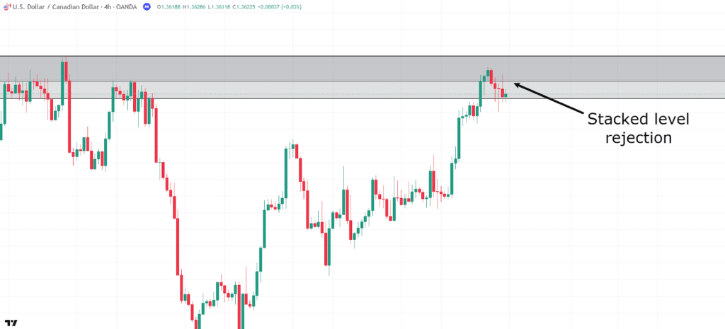
Here, you can see price beginning to pause at the level. On this trading timeframe, there’s a potential setup with a 4-hour rejection.
Let’s take the trade and see how it pans out!…
USD/CAD Stacked Level Take Profit:
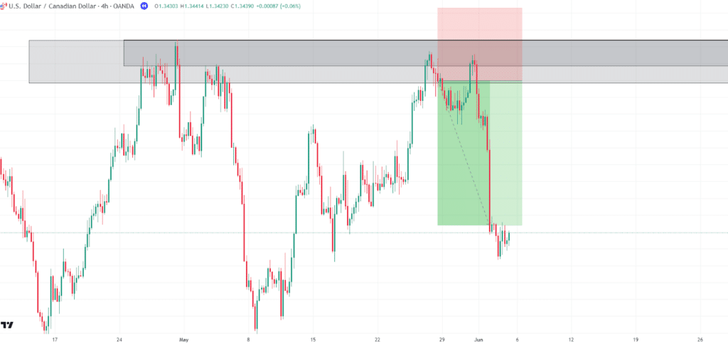
Notice how, by using multi-timeframe analysis, these stacked levels highlight high-probability areas where the price is more likely to react – either bouncing off or breaking through.
Another example of this could be if you had a daily trendline converging with a lower timeframe support or resistance level.
These staked levels give you a much higher chance of price reacting at that area of value.
With all that being said, let’s talk about some of the limitations within MTA.
Limitations of Multi-Timeframe Analysis
Analysis Paralysis
Let’s get real for a second— multi-timeframe analysis isn’t perfect.
One of the main issues I’ve personally experienced is over-analyzing.
You’ve got all these different timeframes giving you various signals, and it’s easy to get stuck in analysis paralysis.
Sometimes, the daily chart says one thing, the hourly chart says another, and you end up not knowing what to do.
A lot of the time, you might even do nothing and watch the trade you had planned slowly tick toward your profit targets without you.
To avoid this, I prefer to keep my focus on the higher timeframe for the overall trend and chart patterns while using the lower timeframe for entries.
Don’t try to find perfect alignment across every single chart, or you’ll drive yourself crazy!
Remember, the higher timeframe is meant to provide context rather than being a science.
Get a feel for what the market is doing on the higher timeframe and execute on the lower timeframe.
Busy Charts
Another challenge? You’ll find tons of support and resistance levels across different timeframes.
This can clutter your chart and make it hard to figure out which levels really matter.
You don’t want your chart to look like a five-year-old got hold of their favorite coloring set and went wild!
Focus on the strongest levels to simplify things, especially those on the higher timeframes.
These levels should be super obvious; pick the ones your eyes are instantly drawn to because, chances are, the majority of traders are focusing on the same levels.
Longer Trade Times
One last limitation of multi-timeframe analysis is that trades will tend to take slightly longer to play out.
This is because your focus shifts from a single lower timeframe to the broader overall market. This can limit traders looking to be in and out of trades quickly.
When you use MTA, you might opt to target the higher timeframe levels rather than just the single trading timeframe target.
This can lead to problems when it comes to taking profits, as it may prevent you from taking money off the table due to targeting a higher timeframe level.
This won’t always work out in your favor, as the higher timeframe setup may never be complete.
So, it’s important to know where you want to take profits, whether that be partially along the way or at the higher timeframe target.
Conclusion
Clearly, multi-timeframe analysis (MTA) is an invaluable approach for traders looking to improve their market analysis and timing.
By integrating MTA into your trading strategy, you gain a much better idea of the market’s overall direction, as well as more precise entry and exit points.
When used alongside other technical tools, MTA provides a significant edge, helping traders spot higher-probability trades and avoid common pitfalls.
To summarize, in this article, you’ve:
- Discovered what Multi-Timeframe Analysis is and why it matters
- Explored the Factor of 4 to 6 and how to choose the right timeframes for analysis
- Gained insight into using price patterns in MTA for more accurate trade entries
- Learned how to identify stacked support and resistance levels for stronger trade setups
- Examined the limitations of MTA, including over-analysis and the challenge of waiting for setups to play out
MTA goes far beyond what’s covered here, but by mastering these foundational principles and integrating them with your other trading techniques, you’ll be well on your way to becoming a more confident and strategic trader.
If MTA resonates with you, I strongly encourage you to research further into it!
Now, I’m curious to hear your thoughts on Multi-Timeframe Analysis!
Do you use it in your trading?
How has it helped you improve your strategies?
Share your thoughts and experiences in the comments below!


