By Lambert Strether of Corrente.
I’ve been design-adjacent for a good part of my working life. So I when I spotted CAPS LOCK in the bookstore (subtitled “HOW CAPITALISM TOOK HOLD OF GRAPHIC DESIGN, AND HOW TO ESCAPE FROM IT”), gave it the packthread test, and it passed, I picked it up. (I think the ALL CAPS cover caught, rather grabbed, my eye; attraction through repulsion, perhaps). I can recommend it to any designer or graphic artist, and indeed to anyone interested in the circulation of commodities, design’s main use case these days:
Capitalism could not exist without the coins, notes, documents, graphics, interfaces, branding, and advertisements; artefacts that have been (partly) created by graphic designers.
Ruben Pater is an an Amsterdam based Dutch designer:
[He] was trained as a graphic designer and works in journalism, activism, education and graphic design under the name Untold Stories…. His first book, The Politics of Design (2016), has been an inspirational sourcebook for design students, artists and visual communicators in many different places and contexts; Eye on Design wrote: “It’s the kind of literature that should be handed out to all students on their first days at art school, along with all the Albers, Berger, Benjamin[,] and Sontag that form the backbone of the design curriculum―an up-to-date assessment of the landscape through which all modern visual practitioners must navigate.”
Pater’s CAPS LOCK (2021) is 552 dense pages, with even denser notes, bibliography, and image credits. (Any book that has quotes from Silvia Federici and Walter Benjamin on the title page is off to a great start.) Here is the central thesis of the book, from the text pp. 7-9:
This book tries to understand how graphic design and capitalism have become caught in an infinite loop of creation and destruction. The central question of CAPS LOCK is twofold; first to historically retrace how graphic design and capitalism came to be intertwined, and secondly what strategies present themselves to unlink graphic design from capitalism, with the intended outcome of developing some kind of vision of a graphic design practice that can exist without capitalism.
And:
—infographics, money, corporate identities, branding—that hide the fact that ‘the economy’ is a collection of social cooperative relations between people [see under “commodity fetishism”]. That’s why, as a critique of design itself, this book doesn’t follow the method of design theory, which usually centres designed objects. Precisely because capitalism manifests itself not only in the appearance of posters, books, or websites, but more in how they are produced, where they are they published, and how they are sold. The first part explains how the work of graphic designers bolsters capitalism and economic relations…. The second part explores how designers themselves are economic actors too.
From one favorable review (there are many), the structure of the book. Design and Culture:
In Caps Lock, Ruben Pater provides a comprehensive and chronological history of the long and complicated entanglement between graphic design and capitalism, which he defines as ‘an economic system that is founded on three basic principles: everything should be privately owned, all production is for the market, and people work for a wage'[1]. He accomplishes this by meticulously examining twelve evolving roles that designers have played throughout history, beginning with ancient Mesopotamian scribes who kept financial records and concluding with interviews with contemporary design activists and activist collectives worldwide attempting to work ethically within the capitalist system. He covers the designer as engineer, brander, salesperson, worker, entrepreneur, amateur, educator, hacker, futurist, and philanthropist. While the list of roles may seem overwhelming, it accurately encompasses the many hats designers wear throughout their career, if not in one day.
In this hasty review, I’m going to present just enough material for you to decide whether to acquire the book for yourself. First, I’ll give two examples of the the insightful true facts about “abstract forms” scattered liberally throughout the book: banknotes and international standards. Then I’ll give two examples of Pater’s approach to social relations: the precariat, and mutual aid. In conclusion, I’ll return to the issue of severing the relation between graphic design and capitalism. (For each of these four examples, I’ll present screen shots of relevant pages; I’m afraid my lack of a copy stand is all too evident, and I apologize for the clumsiness of the highlighting.)
Banknotes
Here is Pater on banknotes:
The insight here — so obvious it’s hard to see — is that the banknote is designed, an abstract form, trust being the essential desideratum in the designer’s brief. I’m forcibly reminded of Terry Pratchett’s Making Money, where newly minted central banker Moist von Lipwig tests his invention of the banknote in Ankh-Morpork, Pratchett’s exercise in world-building:
Where do you test bankable idea? Not in a bank, that was certain. You needed to test it where people paid far more attention to money, and juggled their finances in a world of constant risk where a split-second decision meant the difference between triumphant profit or ignominious loss. Generically it was known as the real world, but one of its proprietary names was Tenth Egg Street…. Tenth Egg Street was a street of small traders, who sold small things in small quantities for small sums on small profits. In a street like that, you had to be small-minded. It wasn’t the place for big ideas. You had to look at the detail. These were men who saw far more farthings than dollars.
After a discussion of monetary theory that would make Stephanie Kelton scream and run, the banknotes pass:
‘So you think these could catch on?’ he said, during a lull.
The consensus was, yes, they could, but they should look ‘fancier’, in the words of Natty Poleforth: ‘You know, with more fancy lettering and similar.’
Design!
International Standards
As readers know, I stan for international standards (“Royale with Cheese”), so here again is an insight so taken-for-granted it’s hard to see:
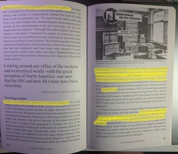
(I love “if there is one victory for statecraft it is the metric system,” and commend it to my anarchist friends). And that the French invention of the A-format for paper — a fundamental constraint for designers today — was optimized by German artillery manufacturers’s in World War I… Well, it’s a wonderful world.
The Precariat
To me, “freelancer” and “designer” are almost synonymous, and have been for decades, very much pre-Uber:
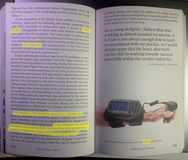
But as far as post-Fordism, wait until symbol manipulation is automated…
Mutual Aid
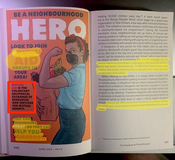
Pater practices what he preaches. In an interview with Print magazine:
[PATER:] Now I only work with local printers and producers, I don’t fly to conferences or lectures, I focus on projects in my neighborhood, in my workshops I focus on local issues rather than “global” ones, and if I work with people I pay them well (the proceeds of the book are shared with all image makers that have contributed). Instead of pushing my own authorship, I prefer giving the stage to young makers so they have a chance to make some money and show their talents.
My latest project is setting up a collective activist media/printing workshop/publishing house/meeting space in Amsterdam, together with extinction rebellion and the anarchist union. The extreme rent prices in Amsterdam make it almost impossible to have permanent spaces devoted to noncommercial purposes, and such a cooperatively organized space would really give a boost to young activist designers and artists looking for places to work. With our own means of production in-house we wouldn’t rely on bulk printers that use toxic inks. It has not been easy to organize a space like that with that many people, but it has already led me to get to know more like-minded people and forge bonds.
Absent The Jackpot, when I would expect most of what we consider “global” to collapse, I don’t know if this approach scales. But it’s certainly worth a try. From Eye on Design:
Throughout his book, Pater grapples with a popular meme that declares “there is no ethical design under capitalism.” In its favor, he lays bare how efforts to design ethically are qualified by this coercive social system that good deeds never quite fix. Even political protest, he shows, can be tolerated by capital or even turned into “causewashing” by brands eager to strike an activist pose. But if the above sounds a bit gloomy, Pater is remarkably optimistic when it comes to opportunities for resistance. Each of CAPS LOCK’s chapters ends with hopeful advice and speculation on ways design can proceed more ethically and less immediately under capital’s control. The wealth of ideas here are inspired by politically engaged collectives like Cooperativa de Diseño in Buenos Aires and The Public in Toronto, which feature alongside four others in extended interviews that make up the book’s last section. Together, they speak to the potential of less hierarchical working relationships, freer access to the tools and products of design, and deeper connections with communities in struggle.
Conclusion
If capitalism were to end, would there even be a need for design? From the American Institute for Graphic Arts:
In fact, the book’s insights add up to suggest that it might be easier to imagine the end of capitalism without design. In a world built not around wages and profits, but around freely associated individuals fulfilling social needs, what place would there be for fine-tuning images for countless, nearly identical products competing for market share?
Pater, however, disagrees. From an interview with Print magazine:
[PATER:] In CAPS LOCK, I don’t present the link between graphic design and capitalism as exclusive. I think we can establish that there is a lot more to graphic design than being a tool of capitalism. Some of the most iconic (Western) design examples from the 1970s–1980s were made for noncommercial purposes—public transport, government services, education, etc. Emory Douglas is a graphic designer I admire who certainly wasn’t a tool of capitalism. The Russian Constructivist designers were anti-capitalist and influential to early modernist graphic design in Europe. There are plenty of examples of graphic design before capitalism existed; whether it’s the Trajan column, Garamond’s types, maps by the Aztecs, or African alphabets. I mention in the book a map found in Spain from 17,000 years ago, etched on a stone. It suffices to say that graphic design has its uses beyond serving capitalism, has existed before, and will exist as long as people need visual communication.
“Exist,” and hopefully be created, first-hand, by humans.
NOTES
[1] It’s hard to get the definition of capitalism on a postcard, so I don’t wish to pick a quarrel here, but the origin of profit (for example) is missing in this formulation. Beginning with the four “ex’s” — extraction, extortion, exploitation, and expropriation — as called out in the front matter to the new translation of Capital Volume 1 by Reiter et al. (summarized by KLG here) strikes me as a better jumping off point.
APPENDIX 1: A Lecture on Caps Lock from Ruben Pater
APPENDIX 2: Hillary vs. MAGA
In the interview with Print, Pater comments:
I often think about the Trump hat design versus the identity Pentagram [, the design firm, made] for Hillary Clinton’s campaign during the U.S. elections [in 2016]. Effective graphic design is not about making something look more beautiful or professional, it is about understanding who you are speaking to, and to show you are interested in what they want without trying to con them. That is exactly why I think graphic designers and journalists are needed.
Here is Clinton’s logo:

And here is a MAGA hat. CAPS LOCK on:

Interestingly — and Pater does not mention this — Clinton’s logo is all about a person: “H” for “Hillary” (with, weirdly, or possibly not weirdly, an embedded arrow pointing right). “MAGA”, on the other hand, is all about policy; or rather, a set of implied policies that will “MAKE AMERICA GREAT AGAIN.” And which was more effective? And which was the con job?


